Information architecture that works in two languages
The biggest challenge with a bilingual website isn’t translation. It’s structure.
English and French content don’t always map one-to-one. Page titles, navigation labels, and section headings can be different lengths. CTAs that work in English might need restructuring in French. An information architecture that looks clean in one language can break in another.
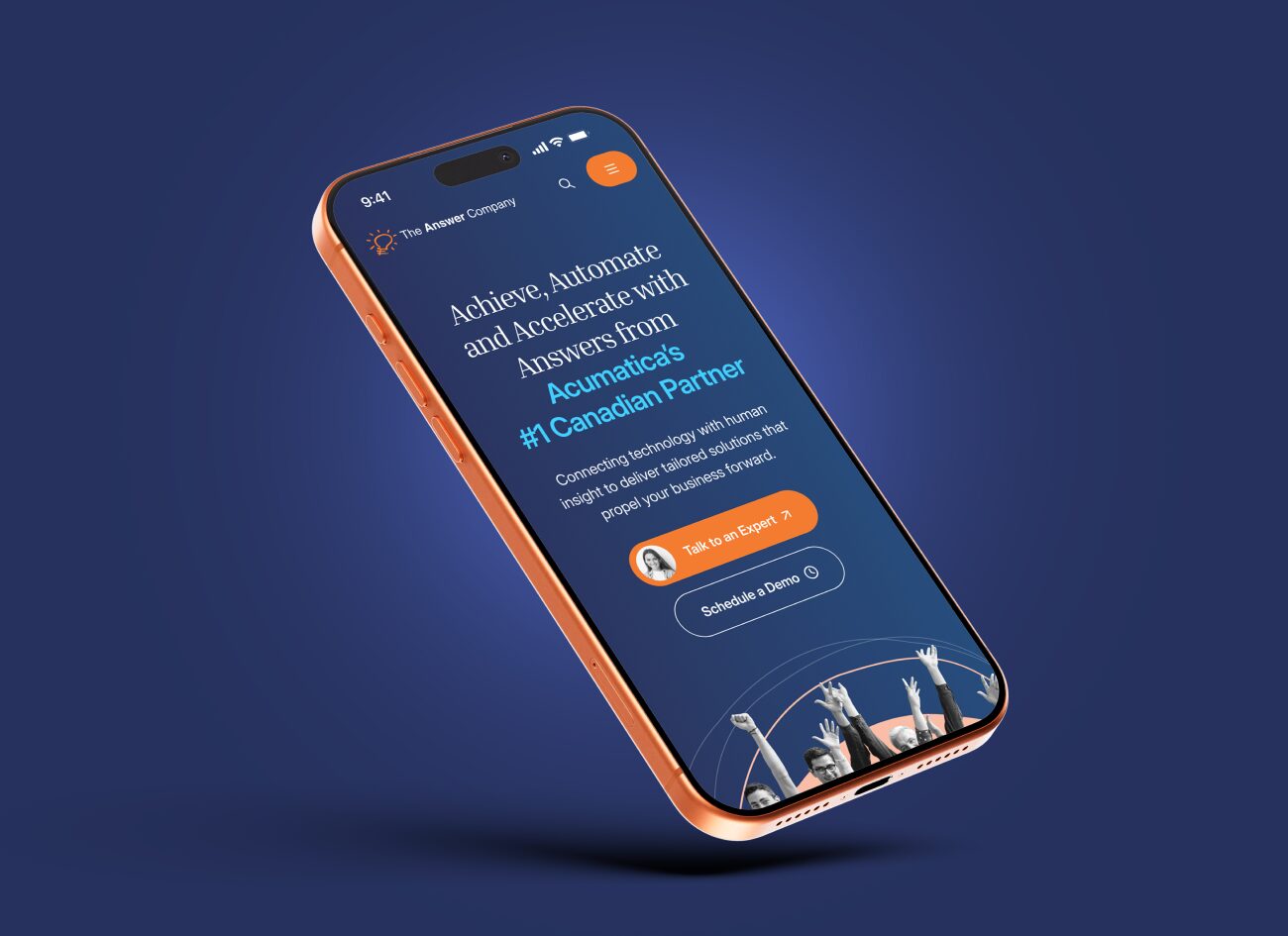
We built the IA to accommodate both languages from the start. Navigation labels were tested in both English and French for length and clarity. Page structures were designed with enough flexibility to handle different content lengths without breaking the layout. The result is a site that feels equally natural in both languages, not an English site with French translations bolted on.
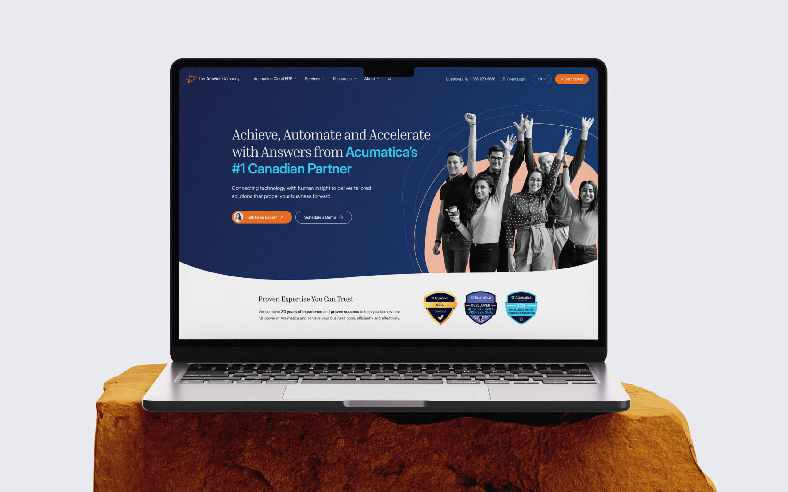
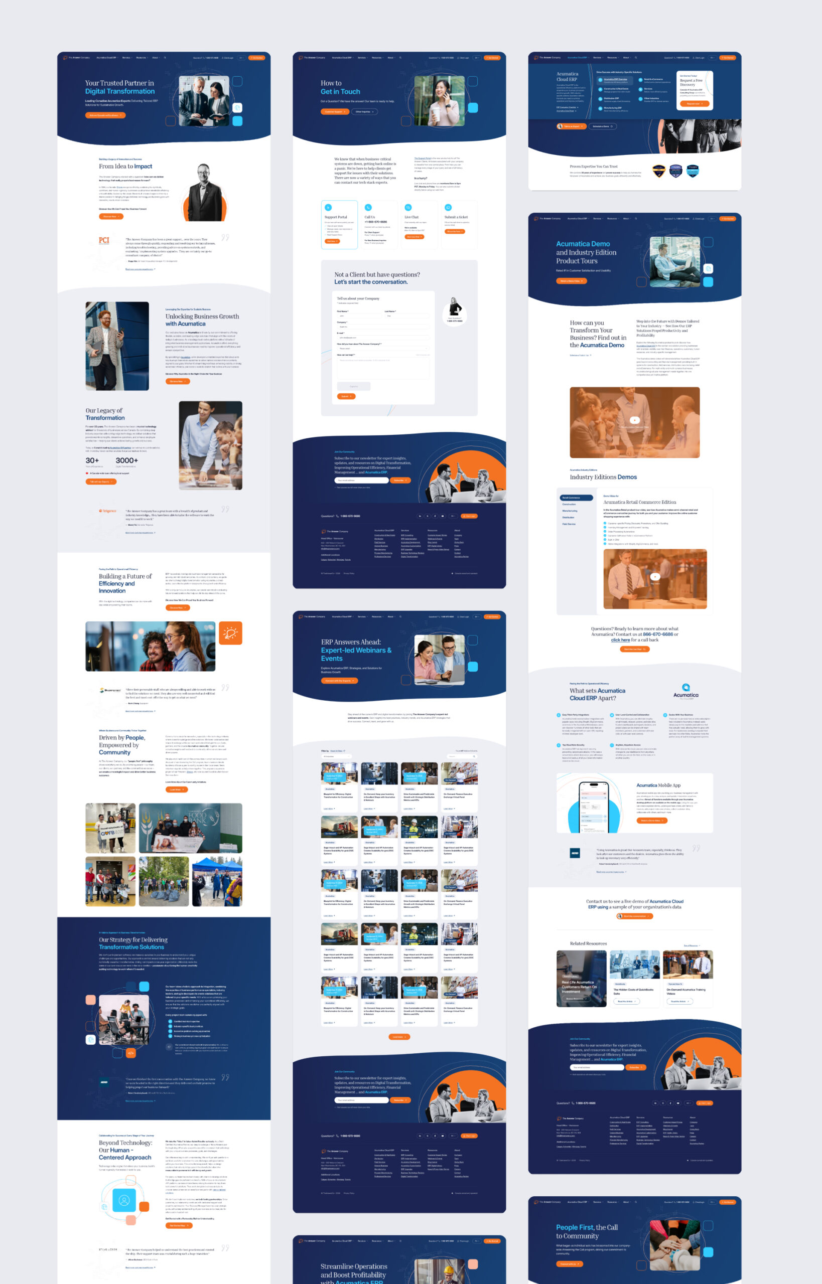
A unified design across 28 pages
28 pages is a lot. Without a system, that many pages start drifting visually: different spacing, inconsistent button styles, sections that look like they belong on different websites.
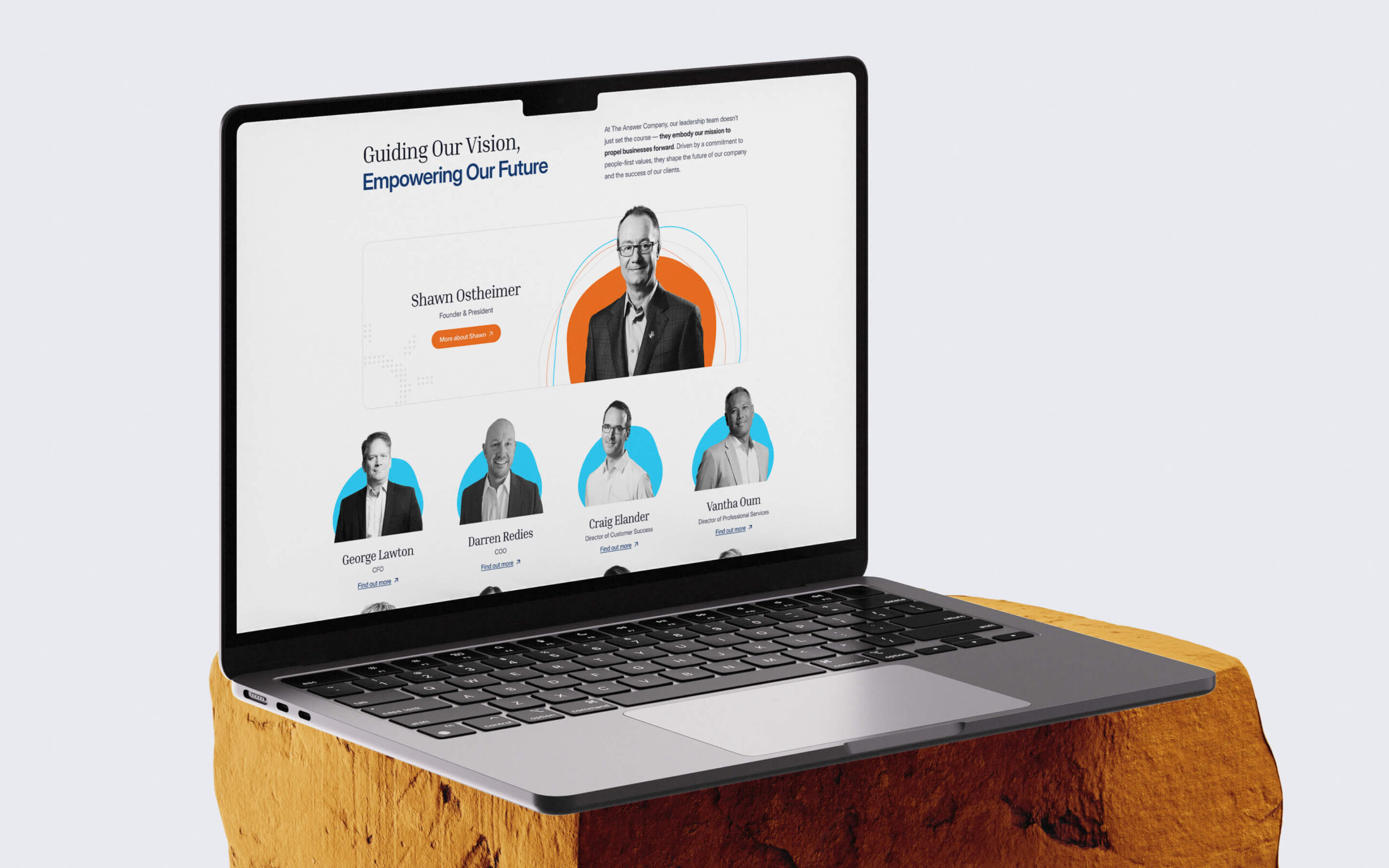
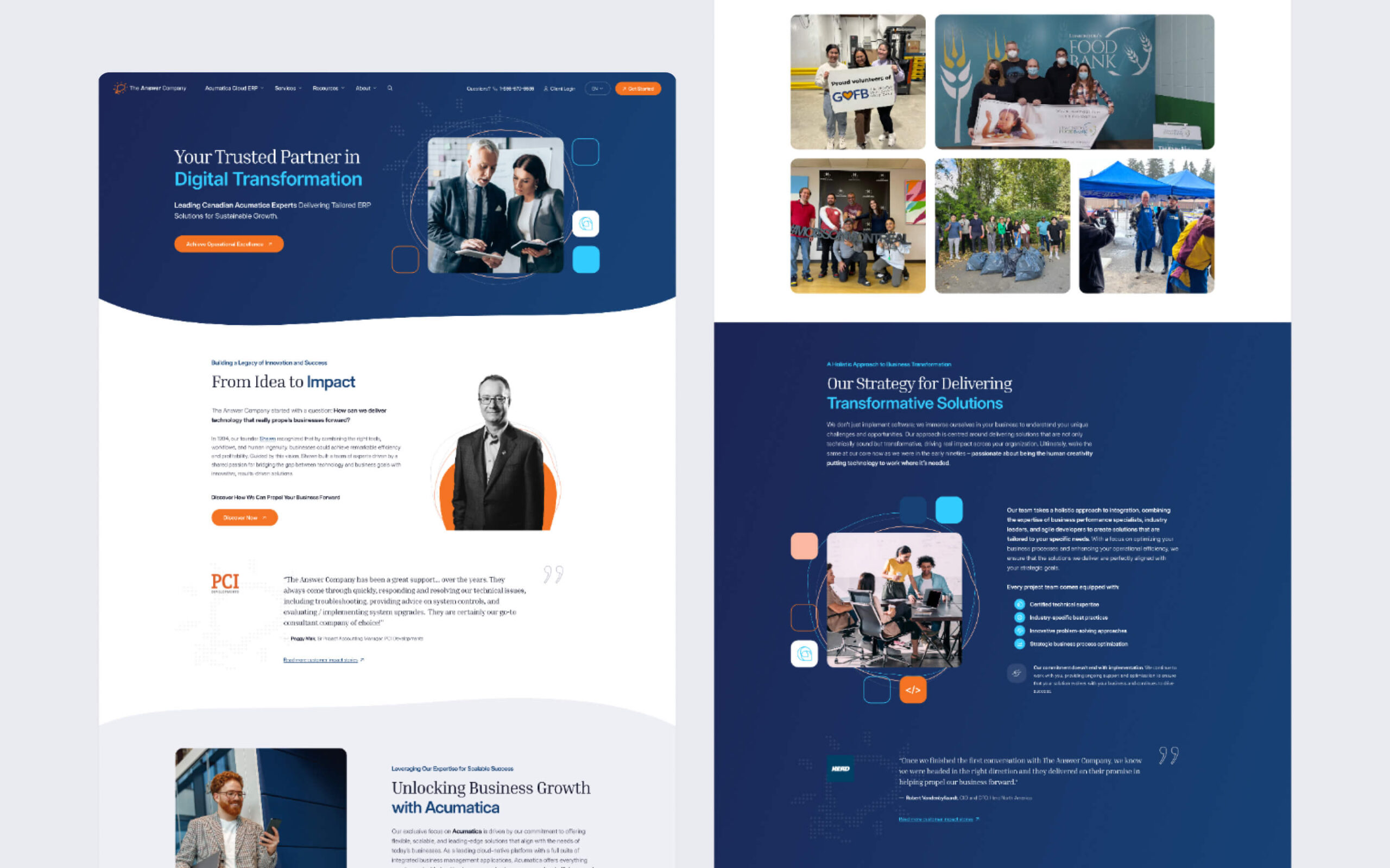
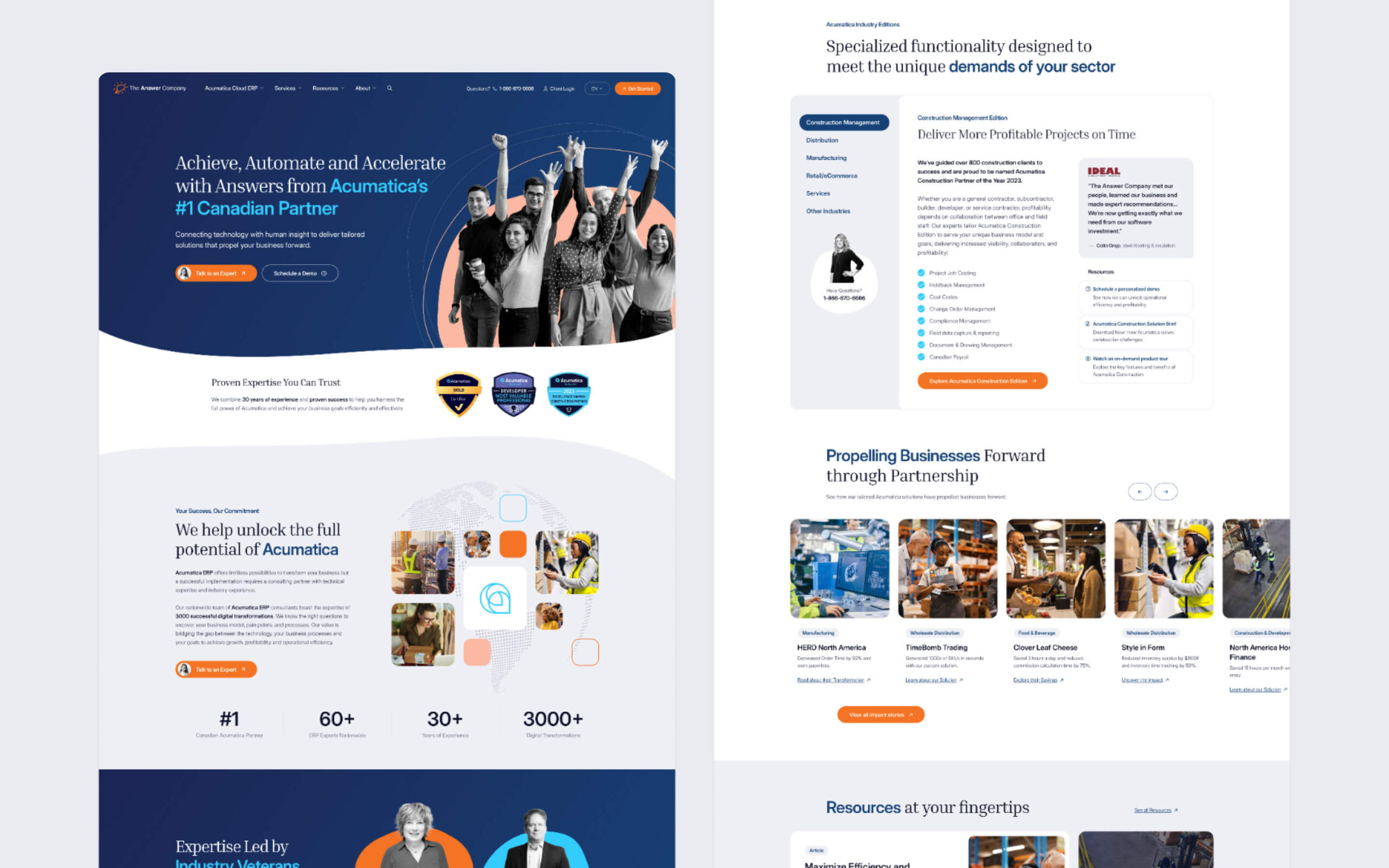
We designed a unified visual language and component library that keeps everything consistent. Every page uses the same building blocks: the same typographic hierarchy, the same colour application, the same spacing rhythm. The components are flexible enough to serve different content types (industry pages, service descriptions, case studies, resource sections) while maintaining visual coherence throughout.
This matters more than it might seem. The Answer Company’s audience, CFOs, COOs, and operations directors evaluating ERP partners, visit multiple pages before making contact. If page 3 looks like it belongs on a different website than page 1, trust drops. The component library prevents that drift.
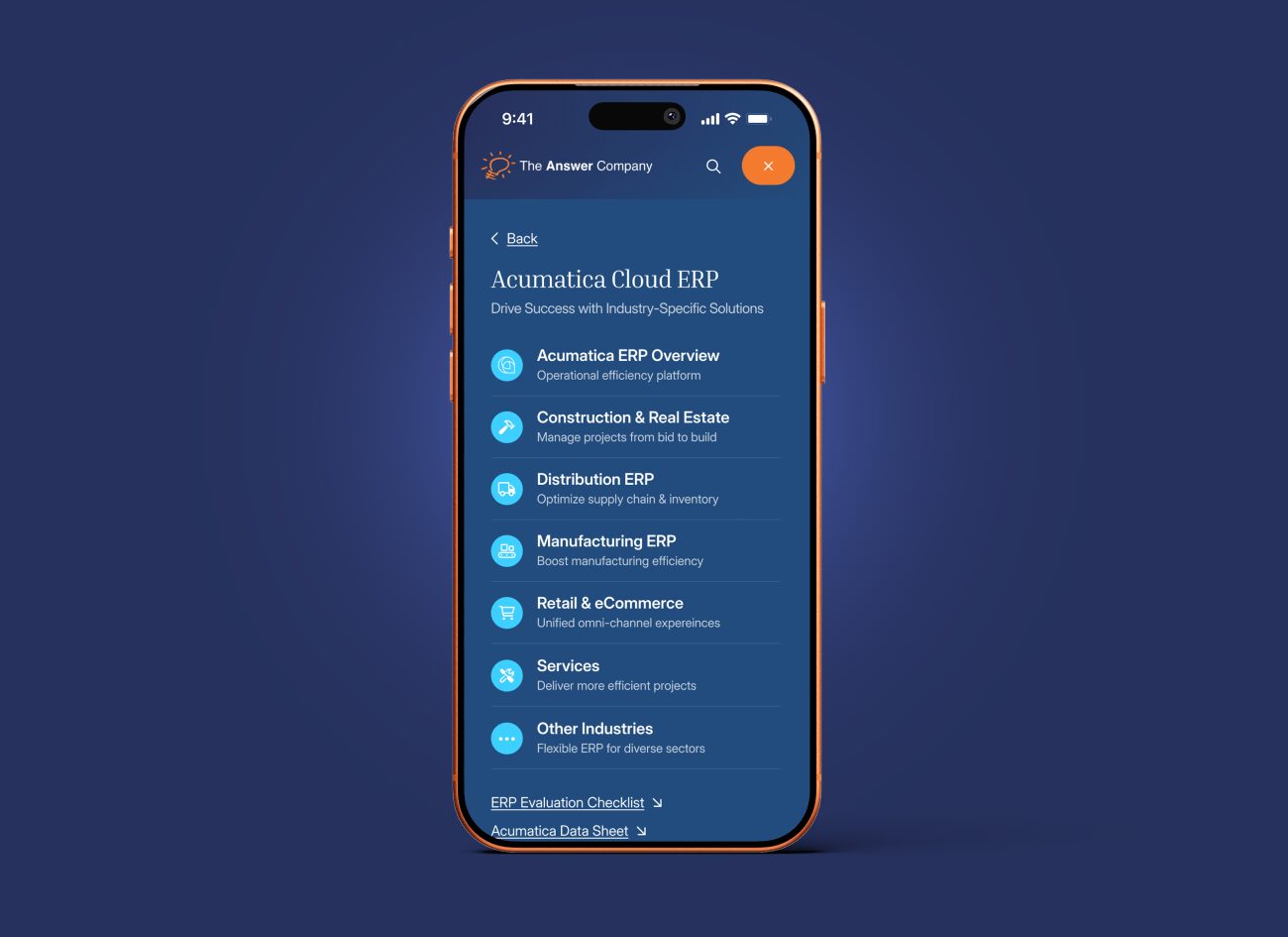
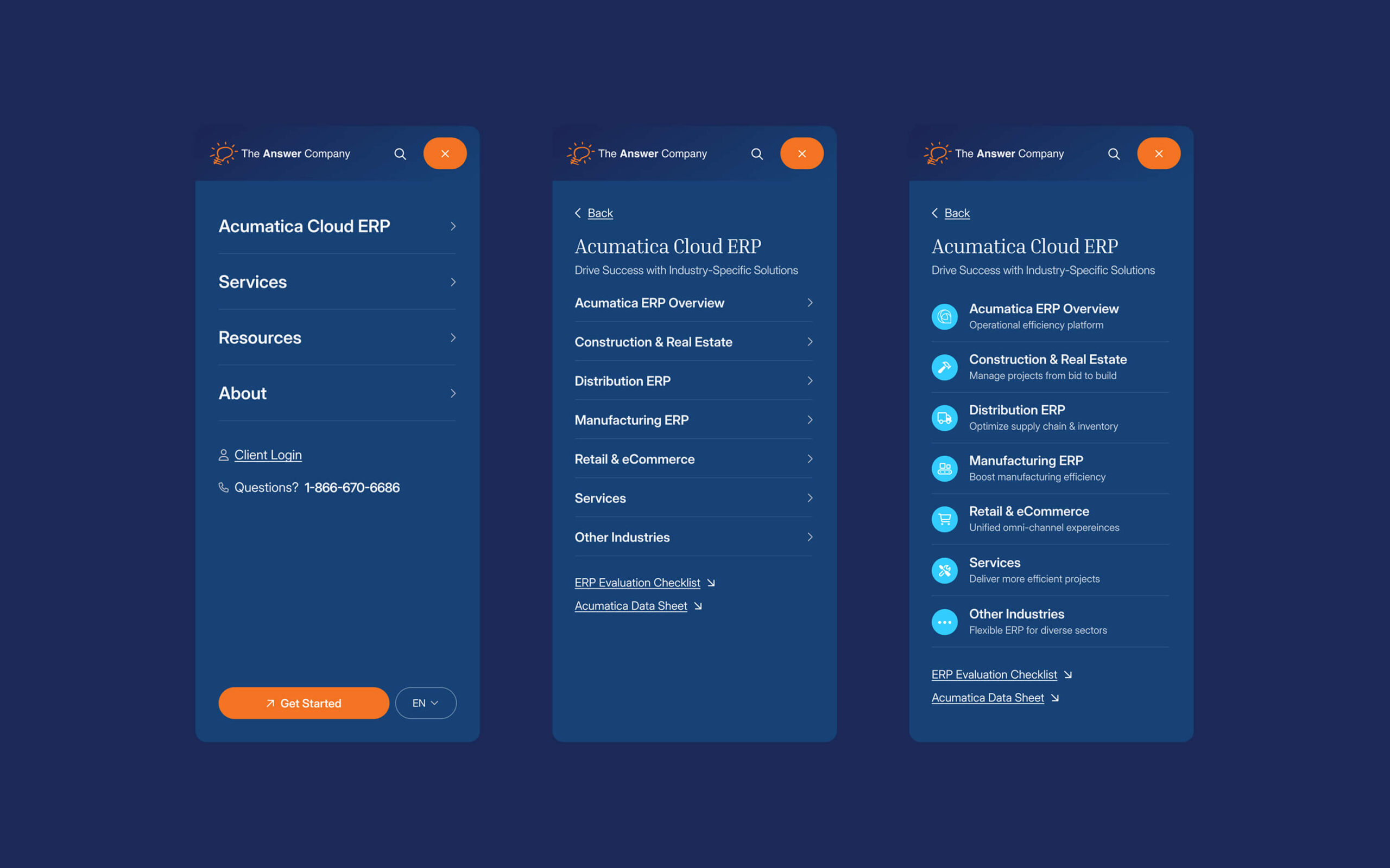
Multi-path navigation for a multi-dimensional offering
The Answer Company’s visitors arrive with different questions. A construction company owner wants to know about ERP for construction. A distribution manager wants to compare Acumatica to their current system. A CFO wants to understand the implementation process and timeline.
A single navigation path can’t serve all of them. We designed a multi-path system that lets visitors enter from any angle, by industry, by service type, or by business challenge, and find relevant content without dead ends or circular navigation.
This is the kind of IA problem that sounds simple on paper but gets complicated fast. Six industries, five service types, multiple integration options, plus resources, case studies, and company information. All in two languages. The navigation had to make this feel straightforward, and it does.
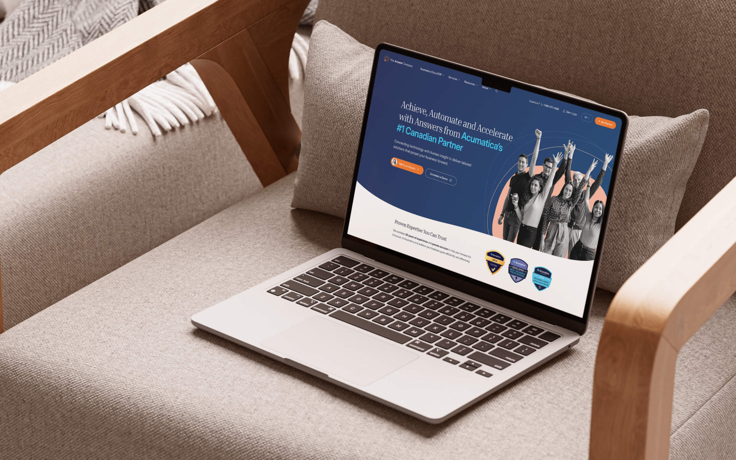
Information-first design
The Answer Company’s content is dense. ERP consulting involves technical specifications, implementation timelines, industry-specific workflows, and certification details. The design needed to present all of this clearly without overwhelming visitors who might not be technical.
We prioritised clarity over decoration. Clean layouts with generous whitespace. A typographic hierarchy that guides readers through complex content. Visual elements that support the information rather than competing with it. The design works hard, but it doesn’t draw attention to itself. It lets the content do the talking.
Tracking that doesn’t slow things down
The Answer Company needed comprehensive tracking to understand how visitors move through the site and where they convert. We integrated third-party tracking systems while keeping page load performance tight.
This balance trips up a lot of websites. Tracking scripts can add significant page weight and slow everything down if they’re not implemented carefully. We built the tracking layer to capture the data The Answer Company needs for their marketing decisions without making visitors wait for it to load.