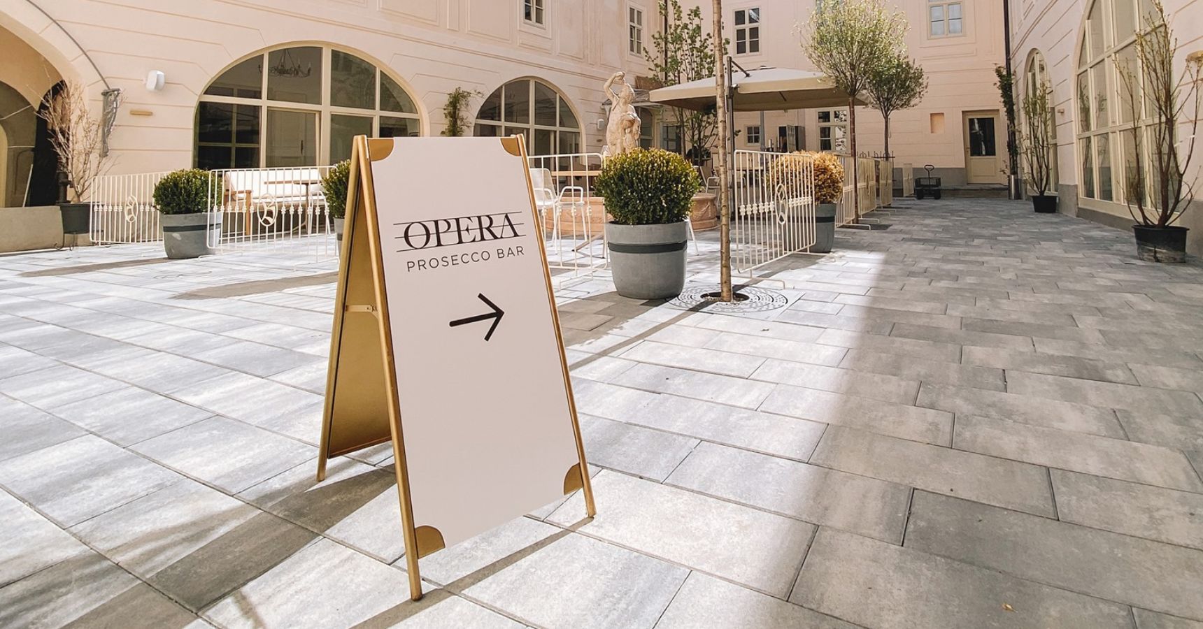
New brand for a business with a unique offer located near the city center of Banská Štiavnica, with a contrast of modern and historical elements in a comfortable interior and exterior.
About the project
At a joint meeting, we determined the product and services, competition, defined the space and USP. We knew that the ideal guest is a tourist in Banská Štiavnica, who comes to enjoy and taste all the pleasant places of this city, enjoys the quality and will pay for it without hesitation.
The name “Opera” was chosen for its elegance and entertainment value, working well in multiple languages.
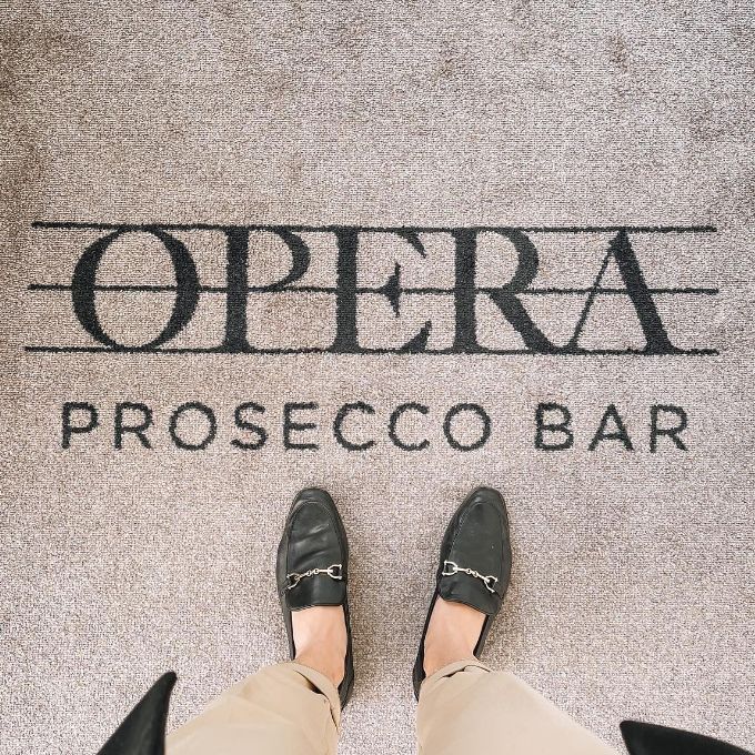
The logo is feminine, sophisticated, luxurious, modern, serious, bold, simple, and unambiguous, representing the high-quality experience we provide.


Thanks to the cooperation with okto—digital, our company acquired a concise corporate identity that really fit into the concept we wanted to bring to customers. The cooperation was very pleasant, fast, full of creativity and brought exactly what we expected. We will definitely continue to work with okto—digital on other projects!


