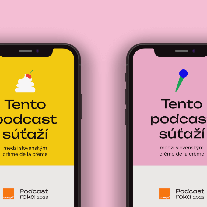
A visual identity built on “crème de la crème”
The competition’s tagline is “podcastový crème de la crème.” We took that literally.
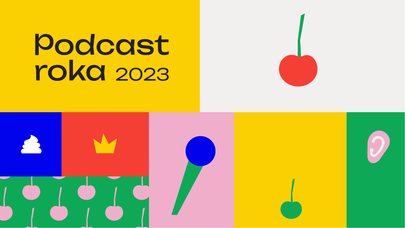
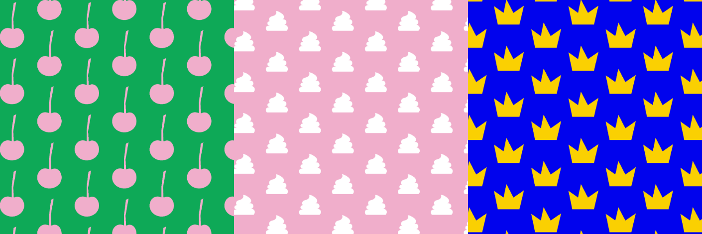
The visual identity centres on a cherry motif, a direct reference to the cherry on top. It appears in the logo, as a recurring decorative element, in seamless patterns, and across competition badges for each category. The cherry becomes the visual shorthand for “this is the best of the best.”
We paired it with a bold colour palette: pink, black, gold, and green. It’s deliberately not what you’d expect from a podcast competition. Most media award shows go dark and serious. Podcast Roka goes bright and confident. That’s a positioning choice. Podcasting in Slovakia is young, creative, and growing fast. The visual identity reflects that energy rather than borrowing gravitas from established award ceremonies.
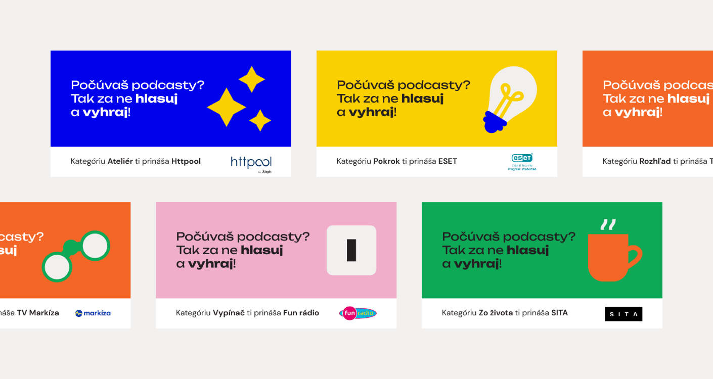
The identity system extends beyond the website to social media templates, category badges (each of the 13 categories has its own icon and visual treatment), competition certificates, and physical event materials.
A multi-phase website that transforms
This is what makes event website design different from regular website design. The Podcast Roka site doesn’t do one thing. It does different things at different times.
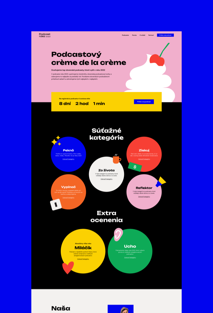
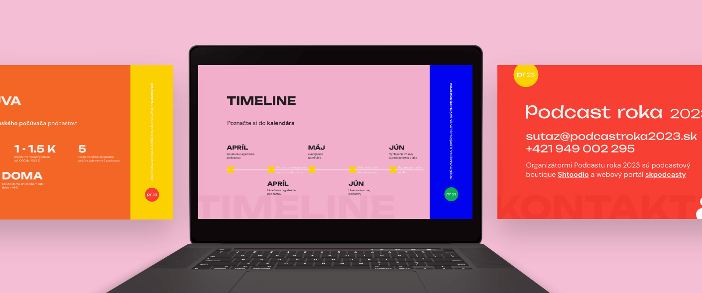
Phase 1 — Build-up: The site introduces the competition, explains the categories, presents the jury, and recruits sponsors. It’s a marketing site. The goal is awareness and credibility.
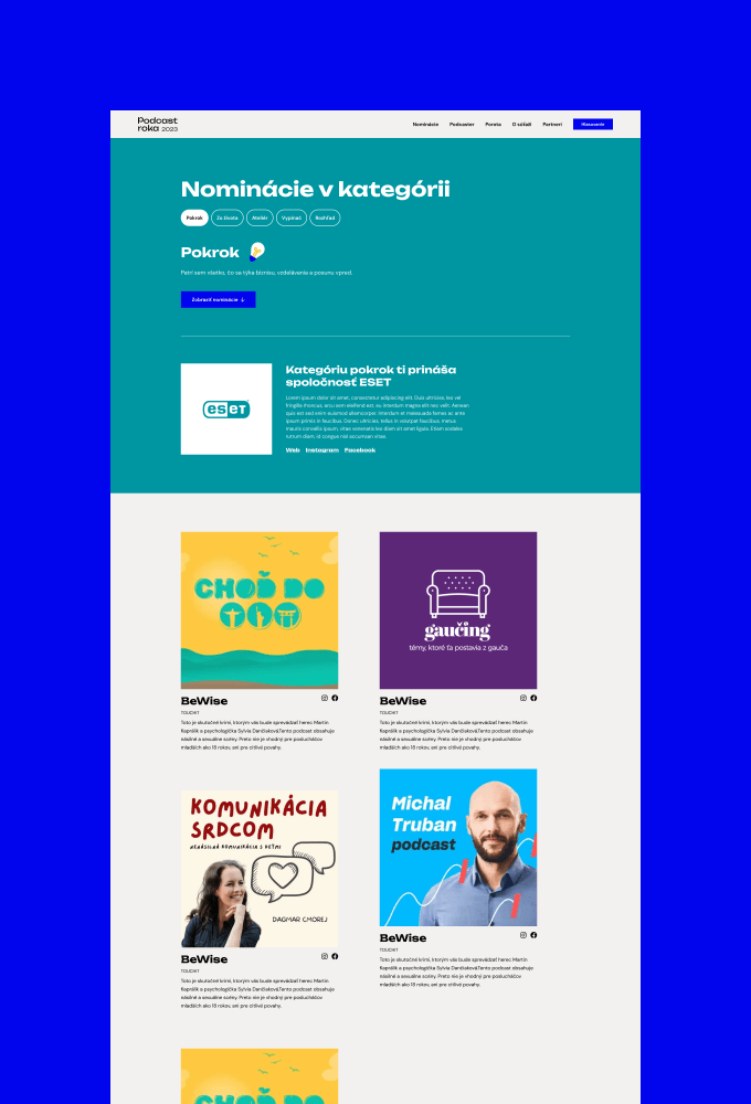
Phase 2 — Nominations and shortlisting: The jury evaluates podcasts and selects top 5 nominees in each category. The site shifts to presenting nominees, their podcast details, and building anticipation for public voting.
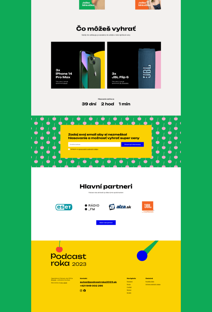
Phase 3 — Voting: The site becomes a voting platform. 33,129 voters cast 223,000 votes over three weeks. The interface needs to be simple enough for casual podcast listeners and robust enough to handle traffic spikes. Fair voting mechanisms prevent manipulation while keeping the process frictionless.
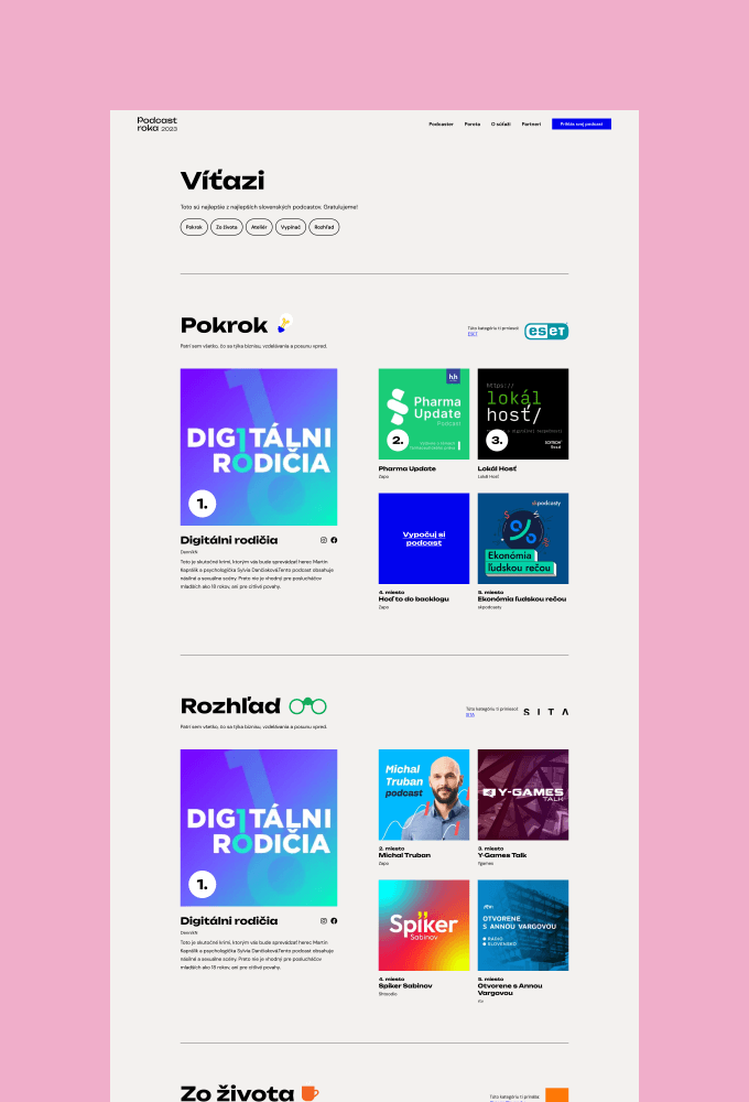
Phase 4 — Winners: The site transforms again to celebrate the winners. Results across all 13 categories, winner showcases, and archive content for the year.
Each phase needed its own design, functionality, and content. The site had to evolve without feeling disjointed. A visitor who saw the site in January and returned in June needed to recognise it as the same brand, even though the purpose and interface had changed entirely.
A voting system built for 223,000 votes
The voting system was the technical core of the project. 33,129 unique voters casting 223,000 votes across 13 categories over three weeks. That’s roughly 10,600 votes per day during the voting phase.
The system needed to handle traffic spikes (voting tends to cluster around social media pushes and the final days), prevent duplicate voting and manipulation, provide a smooth experience on mobile (where most votes came from), and produce reliable results that a 20-member jury and the public could trust.
Fair voting mechanisms were non-negotiable. When sponsors like Orange and ESET are attached to specific categories, the integrity of the results matters beyond the competition itself. The voting system had to be bulletproof.