Discovery before anything else
We started with discovery. Not a mood board, not a design sprint. Actual research into who Technobox is, what their clients expect, and where the gap was between perception and reality.
This matters because a brand refresh for a property services company isn’t about making things look modern. It’s about understanding what “trustworthy” and “professional” look like to the specific people who hire companies like Technobox: developers, investors, and property owners evaluating partners for projects worth millions.
Discovery shaped every design decision that followed. It told us the brand needed to feel structural and precise (reflecting the engineering side of their work) while staying approachable enough for the consulting and management relationships they build.
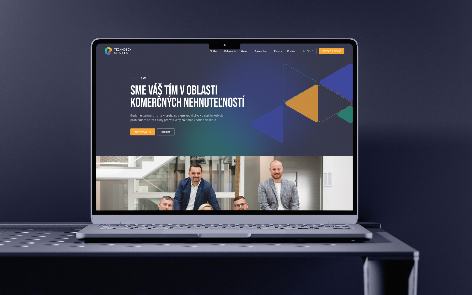
A triangular motif that earns its place
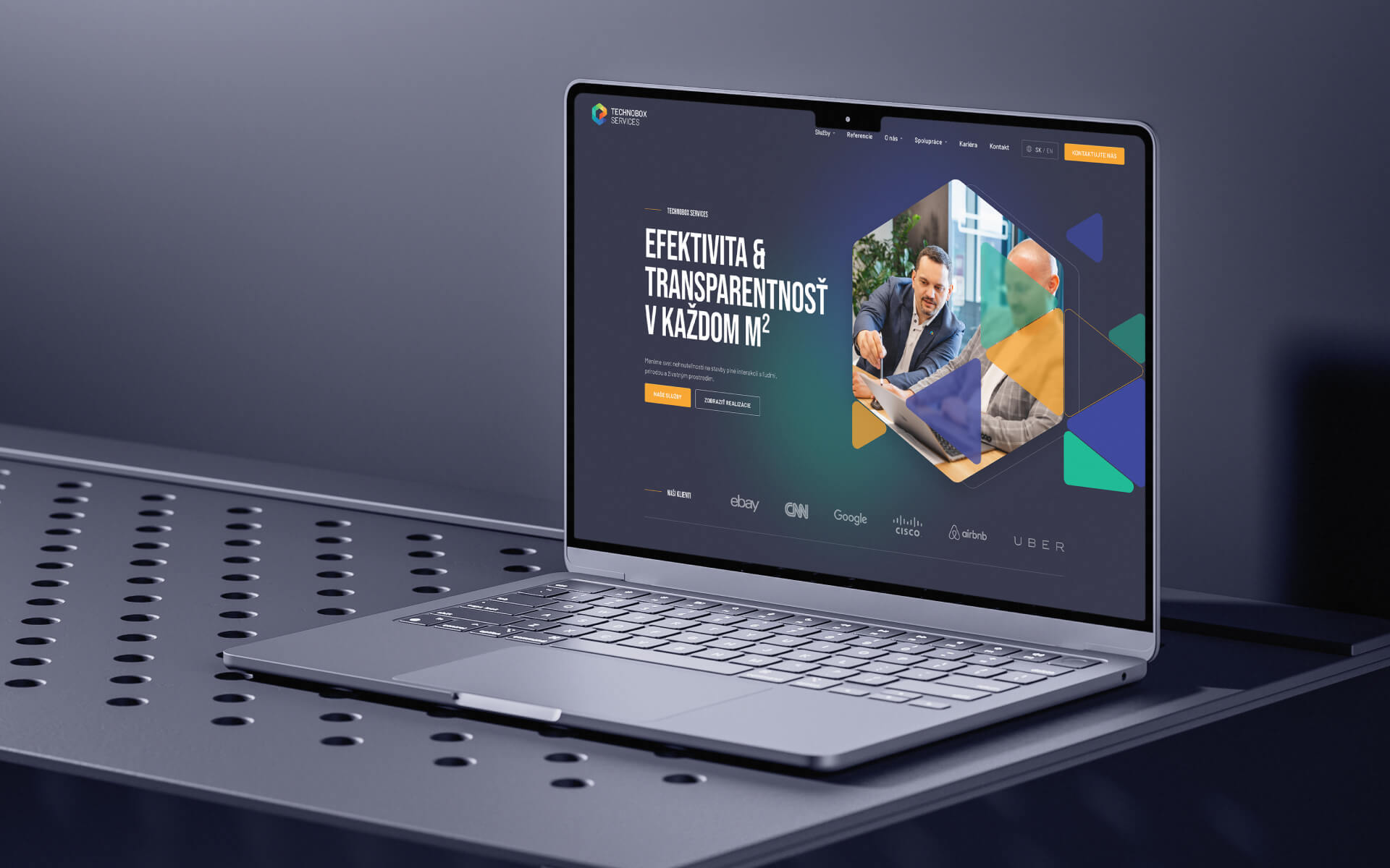
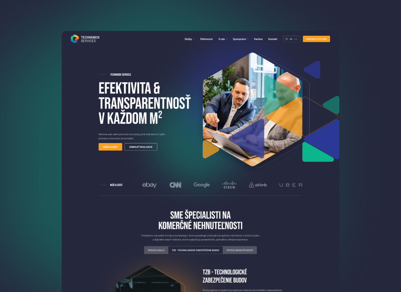
The refreshed visual identity centres on a triangular geometric motif. This wasn’t decorative. Triangles are the strongest geometric shape in structural engineering. They appear in trusses, frameworks, and load-bearing structures across construction and architecture. For a company that literally builds and manages commercial properties, the reference is direct.
The motif runs through everything: the logo, section dividers, image frames, icon containers, and background elements. It creates a consistent visual language that ties the brand together across the website, printed materials, and team workwear. When you see the triangular framing on a Technobox business card and then visit their website, the connection is immediate.
We paired this with a dark navy and vibrant orange colour palette. The navy communicates professionalism and stability. The orange adds energy and makes CTAs and key information stand out against the darker backgrounds. It’s a combination that works for both the boardroom presentations and the construction site documentation.
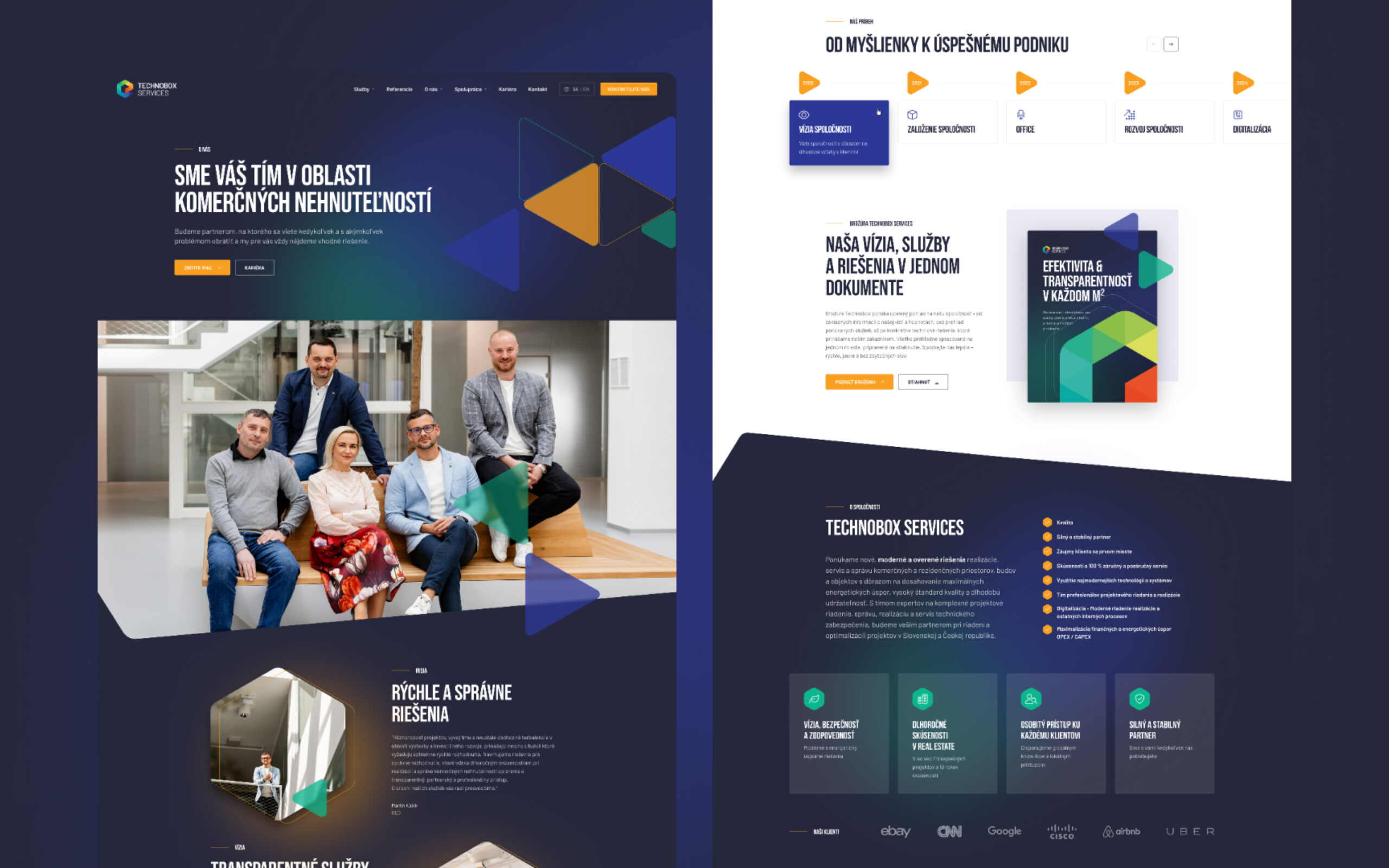
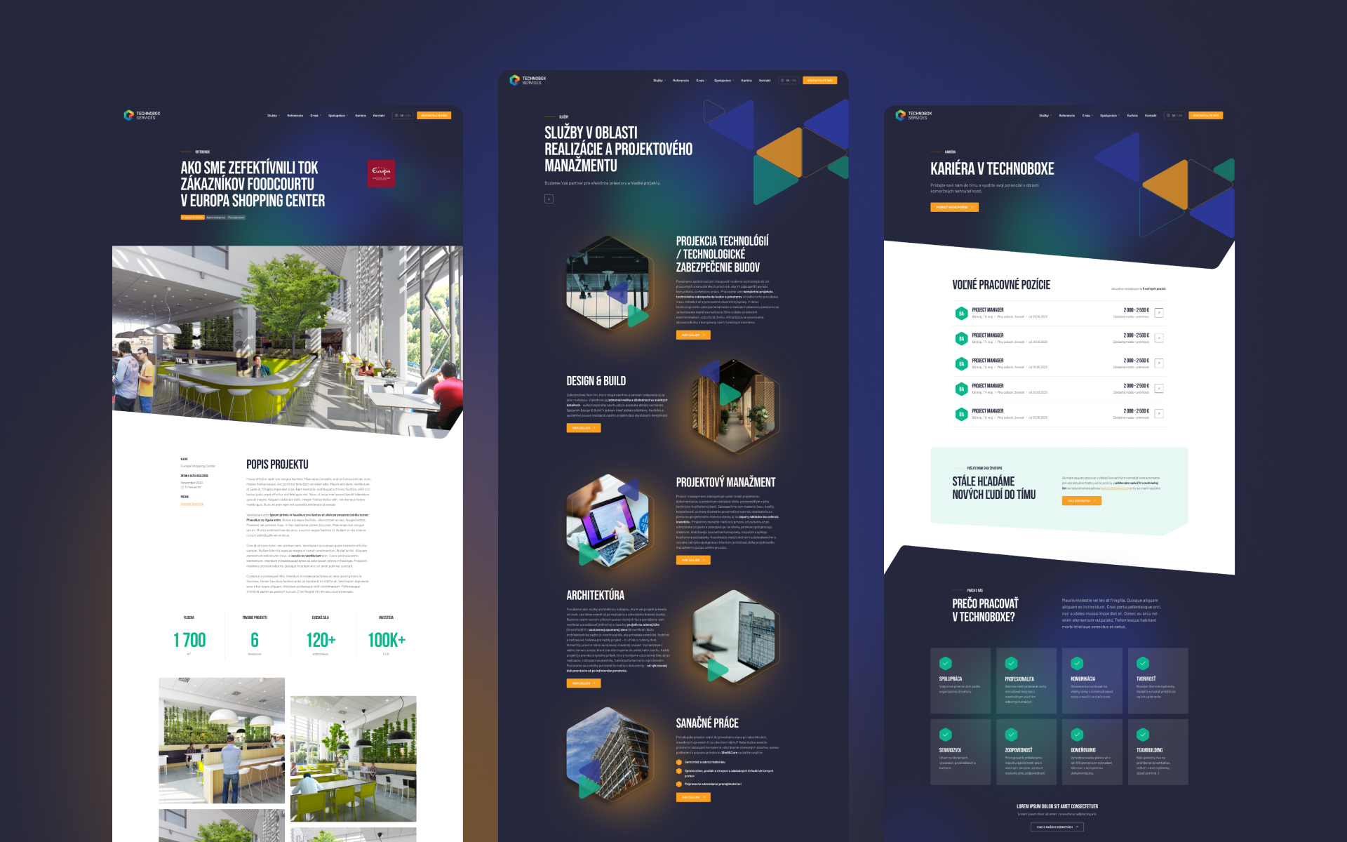
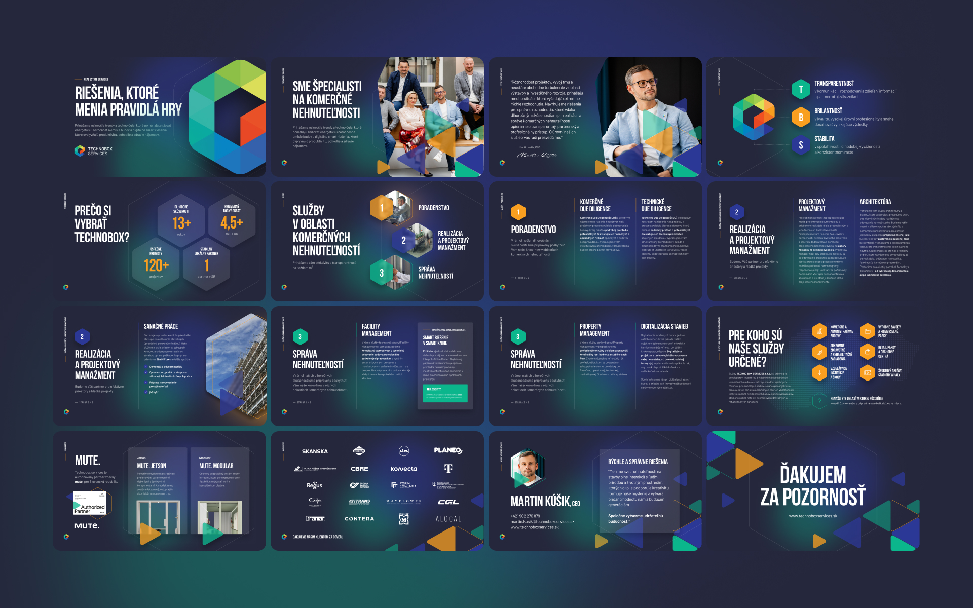
30 screens with one visual language
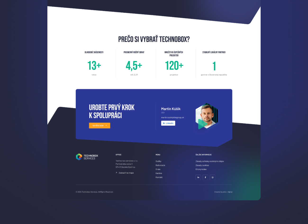
With the brand identity established, we designed 30 screens that all speak the same visual language. This included service pages for each of their three pillars (consulting, realisation and project management, real estate management), industry-specific content, project references, team profiles, and company information.
We built a component library so these 30 screens share the same building blocks. Same typographic hierarchy, same spacing rhythm, same interaction patterns. The component approach means Technobox’s team can build new pages as the company grows without the design drifting away from the brand system we established.
30 screens is significant. At that volume, visual consistency doesn’t happen by accident. It happens because you have a system enforcing it.
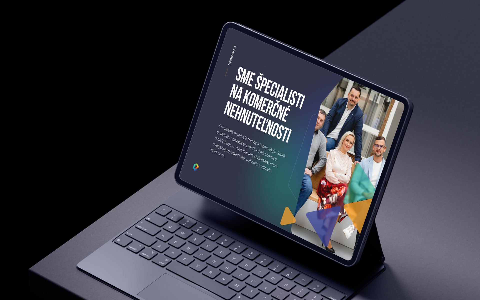
Bilingual without the compromise
Technobox operates primarily in Slovakia but works with international clients and partners. The website needed to function fully in both Slovak and English. Not a partial translation. Full bilingual content across every page.
We built the bilingual architecture into WordPress from the start, with content management that lets their team update both language versions independently. The design accommodates both languages without layout issues. Slovak and English have different word lengths and sentence structures, so every component was tested in both to make sure nothing breaks.
Four months, kickoff to launch
The full project, discovery, brand identity, 30-screen design, WordPress development, bilingual setup, content migration, performance tuning, and security hardening, went from kickoff to launch in four months.
That timeline works because the brand and website were treated as one integrated project. When the brand identity was being finalised, the website structure was already mapped. When the first screen designs were approved, development was beginning on the component library. Parallel workflows, not sequential ones.