Good UX makes products usable
A beautiful user interface that confuses people isn't good UX. A simple UI that helps users complete their tasks quickly? That's what our agency is after. UX isn't decoration. It's how your product works.
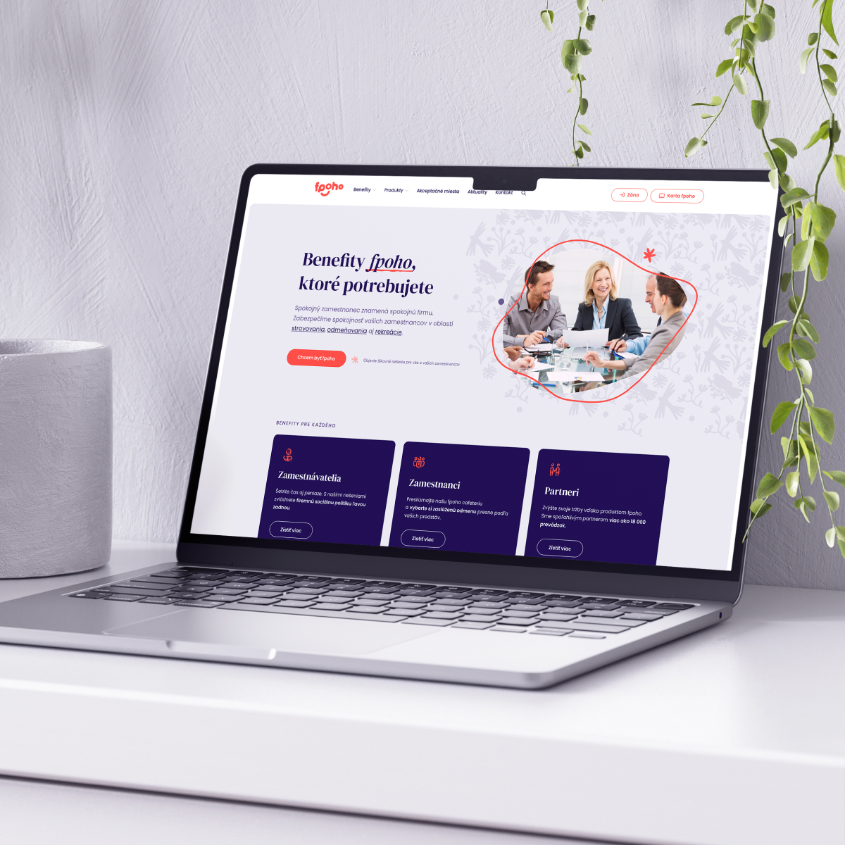
Good design follows rules. It needs to match your brand, use consistent fonts with sizing, maintain contrast ratios, follow proven UX patterns, and a lot more. Break one rule and it falls apart. We’re a design agency that builds user interfaces following these rules, even when real people show up with messy data.
Good UX and UI design makes digital products easier to use. Here’s why it’s worth the investment.
A beautiful user interface that confuses people isn't good UX. A simple UI that helps users complete their tasks quickly? That's what our agency is after. UX isn't decoration. It's how your product works.
Every piece of content has a natural way it should be presented. FAQs work better as accordions than tabs. They scale vertically, handle answers of varying lengths, and avoid breaking the layout. We know these UX patterns. We'll guide you toward what actually works, even if it's not what you initially imagined.
When design files are clean, organized, and structured properly, developers can build faster. They'll know your color scheme, font sizes, spacing, and component structure without hunting through messy layers. That means fewer questions, fewer mistakes, and faster timelines.
We don’t chase trends or prioritize style over function. These principles guide every UX and UI decision our design agency makes.
Simple, functional, built for real user needs. People should find what they're looking for without effort. Navigation should make sense. Interactions should feel natural. Good user experience is our top priority.
Every content type has a proven way to be displayed. Accordions for FAQs, cards for browsing, lists for scanning. Our design agency guides you toward what works.
If something looks cool but breaks usability, we'll tell you. We'll explain why it's a UX problem and suggest what works better. Unlike other agencies, we won't just agree with everything.
Great UX means working around real data, not placeholder content. We test layouts with actual copy, actual images, and actual edge cases. User research informs every creative decision, because user experience falls apart when you design in a vacuum.
Tabs vs. accordions. Horizontal scrolling vs. vertical lists. Carousels that autoplay vs. static content. We have these discussions because we care about the end result.
We focus on digital design for user interfaces.
We don’t do: email design, social media graphics, illustrations or artwork, print materials
Our design process follows a clear path from research to delivery.
Start here. Before we design anything, we need to understand what you're building and who you're building it for.
Discovery covers your business goals, target users, competitive landscape, and content requirements. User research answers the foundational questions that inform every UX and UI decision.
Discovery is a separate service, but we can bundle it with design services if needed.
Once we understand the project, we start with two key deliverables:
Moodboards show the creative visual direction: colors, typography, imagery, overall style. This is where we align on the look and feel before committing to detailed digital design work.
Wireframes show the structure: layout, navigation, content hierarchy, and user flow. No colors, no branding. Just the skeleton of how the UI will work.
These two steps ensure we're on the same page before diving into full visual design.
Now we bring it all together. Structure, content, branding, and functionality combine into the final interface design.
How revisions work: You'll get a first version, then two rounds of revisions. You'll comment directly in the Figma file, and we'll iterate from there.
Approval matters: Once a screen is approved, it's locked. If we're doing phased work (design and build in parallel), screens move to the team after approval. No revisions once the build has started. We make sure you're happy before moving forward.
What you get depends on whether you're doing design only or design + build with us.
Design only projects: You'll receive the complete Figma design file. It's yours. Organized, clean, and ready to hand off to your team.
Design + build projects: You'll receive the finished website or app. We use the design internally to build, but the final deliverable is the working result, not the design files.
More than pretty mockups. You’ll receive organized files ready for developers that speed up delivery and reduce costs.
Most designers deliver a mess: layers named "layer," no grouping, fonts applied inconsistently, spacing all over the place. Developers have to guess at design decisions, ask a dozen questions, and waste time figuring out the file.
Result: faster delivery, fewer questions, lower costs.
We don't just make things look nice. We build a system: reusable UI components, consistent UX patterns, clear structure. It scales as your project grows.
If you need to add new screens later, you'll have the components and patterns already defined. Your design stays consistent. Your user experience feels cohesive.
You're not working with a solo freelancer. Our agency team collaborates, exchanges knowledge, reviews each other's work, and ensures consistency. We have the capacity to handle larger projects faster than a single person could.
User experience design is at the core of what we do. We've spent15+ years working on digital projects across industries. We know what works, what doesn't, and why.
Once design is complete and approved, you’ll move to development. Design and development are priced separately. You’ll know exactly what each phase costs before we start building.
We’ve designed for companies across industries. Here’s what working with us looks like.

UX and UI design pricing based on bundled hours. Choose the package that fits your project scope.
Quick projects and updates
Timeline: 1-2 days
Most popular for small to medium projects
Timeline: 1 week
Large projects and complex applications
Timeline: 2-3 weeks
Our company offers hourly rates for continuous projects.
Not sure which tier you need? Contact us and we’ll help you decide.
Common questions about the design process, deliverables, and working with us.
It depends. For bespoke and WordPress websites, yes. Discovery ensures we’re designing for the right audience, goals, and business context. For static websites or small projects, we skip formal discovery and use a short interview to gather basic requirements. If you’re not sure whether discovery makes sense, we’ll help you decide based on project complexity.
You’ll get two rounds of revisions included in the design phase. You’ll comment directly in the Figma file, and we’ll iterate from there. The goal is to get you to a UX and UI design you’re happy with before moving to development. We make sure you’re satisfied before locking anything in.
Yes. If you have brand guidelines (colors, fonts, logo usage, tone), we’ll design within those constraints. If you don’t have guidelines yet, we’ll help establish a creative visual direction through moodboards and design exploration.
Design only means you receive the complete Figma file. Organized, clean, and ready to hand off to your developers. Design + development means we use the UX and UI design internally to build, and the final deliverable is the working website or app, not the design files. Most clients choose design + development for seamless handoff and faster timelines.
Two rounds of revisions are included per screen or section. You’ll review the first version, provide feedback, and we’ll iterate. After the second round, the UX design is locked and moves to the build phase (if you’re doing both with us). Additional revisions beyond two rounds can be added for an extra cost.
You’ll receive Figma files, the design tool used across the industry. Figma files are cloud based, organized, and easy for developers to view and work with. If you’re doing design only, you own the file and can share it with your team. If you’re doing design + build with us, we use the file internally and deliver the finished result instead.