Discovery to understand the repositioning
Before we touched a wireframe, we needed to understand the gap between fpoho’s current positioning (voucher supplier) and where they needed to be (comprehensive benefits partner).
Discovery revealed three critical insights. First, fpoho serves three fundamentally different audiences (employers, employees, and partners) who each need different information presented in different ways. Second, the 20+ products and services needed a hierarchy that guides visitors rather than overwhelming them. Third, the brand’s visual language needed to shift from transactional to warm and relational, reflecting the human side of employee benefits.
These insights shaped every decision that followed.
Organising 20+ products without overwhelming anyone
This was the hardest part of the project. fpoho offers meal vouchers, electronic meal cards, benefit vouchers, recreation vouchers, sports vouchers, a mobile app, an employer portal, employee accounts, HR consulting, workplace safety training, corporate insurance, team building services, and more. That’s a lot to present clearly.
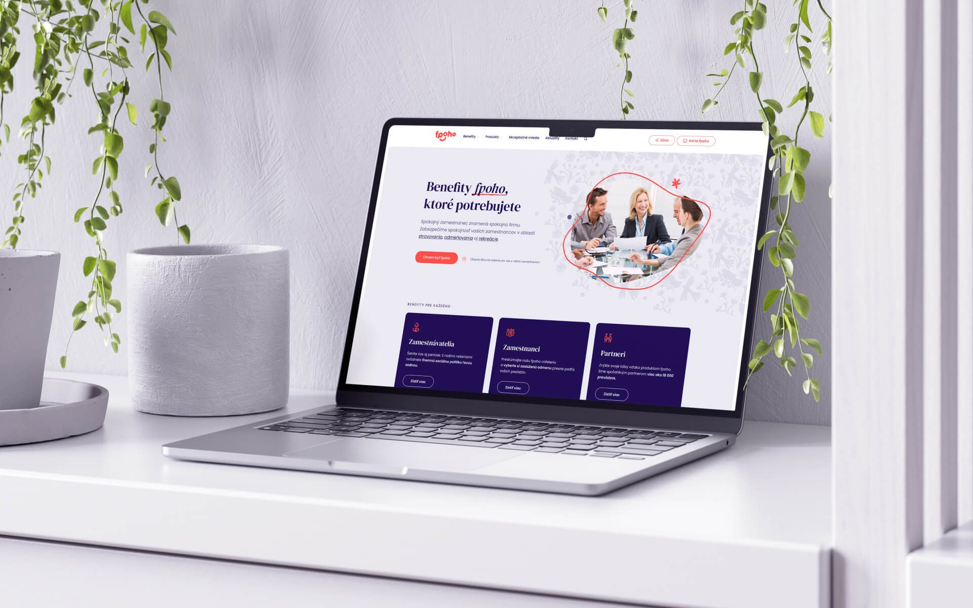
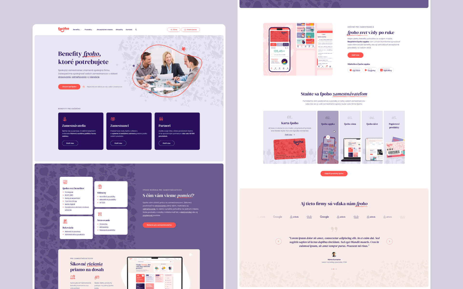
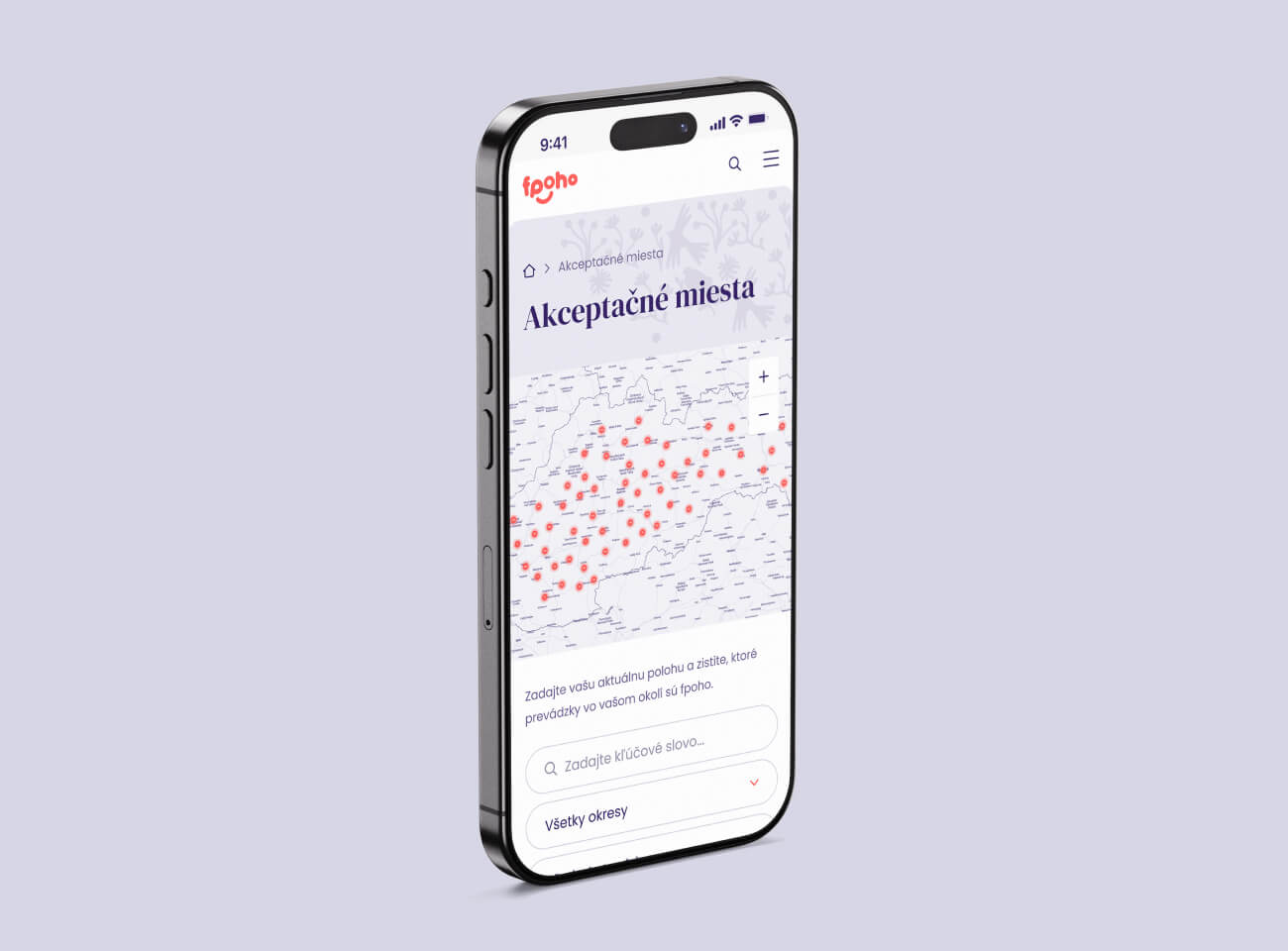
We built a product taxonomy that groups related offerings and reveals them progressively. Visitors don’t see all 20+ products at once. They see the category that’s relevant to them (meals, rewards, recreation, extended services) and can drill into specifics from there. The navigation mirrors this structure: employers find employer-relevant products, employees find employee tools, and partners find the information they need to join the acceptance network.
The result is a 60+ page site that feels simple despite its complexity. A CFO evaluating fpoho as a benefits provider can find what they need in two clicks. An employee checking their card balance can get there just as quickly.
A warm visual language for a human business
Employee benefits is fundamentally about people. Workers getting a proper lunch. Families going on recreation holidays. Teams building connections. The visual design needed to reflect that.
We moved away from the corporate blues and greys that dominate the benefits industry and built a warm, approachable colour palette. Friendly iconography replaces generic stock illustrations. The typography is clean but not cold. Photography shows real situations rather than corporate handshakes.
This is a deliberate positioning choice. fpoho’s longest client relationship is nearly 20 years old. That kind of loyalty doesn’t come from transactional efficiency alone. It comes from a company that actually cares about the people using its products. The design needed to communicate that.
Restructuring the information architecture
The old site’s navigation had grown organically over the years. New products got added wherever they fit. Sections aimed at employers, employees, and partners were mixed together. Finding specific information required knowing where to look.
We rebuilt the IA from scratch. The primary navigation separates content by audience: what employers need to know, what employees can do, and how partners can join. Within each audience path, products and services are organised by category, not by the order they were historically added.
This sounds straightforward but it required mapping every piece of content from the old site, understanding which audience it serves, and placing it where that audience would expect to find it. Content that served multiple audiences got restructured so each version speaks directly to its reader.
Content migration without losing anything
fpoho’s existing website had 25 years of accumulated content. Product descriptions, partner information, legal documents, blog posts, support articles. All of it needed to move to the new WordPress site without broken links, missing pages, or lost SEO value.
We ran a full content audit before migration, cataloguing every page and its purpose. Content that was outdated got flagged for removal or rewriting. Content that was still relevant got migrated and restructured to fit the new IA. Redirects were set up to preserve any existing search rankings.
For a 60+ page site with a legacy content base, this is the part of the project that prevents embarrassing gaps showing up six months after launch.
Three months from approval to launch
The full build, from design approval through WordPress development, content migration, performance tuning, and security hardening, went live in three months.
For a 60+ page site with 20+ products, three distinct audience paths, and a complete content migration, that’s a tight timeline. It worked because the discovery phase and IA restructuring were thorough enough that the design and development phases didn’t hit structural surprises. When the foundation is solid, the build moves fast.