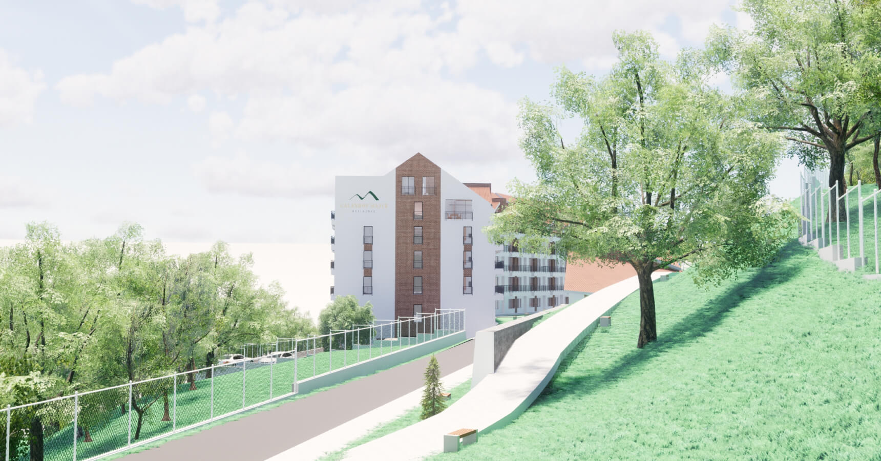
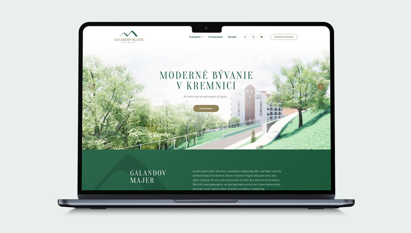
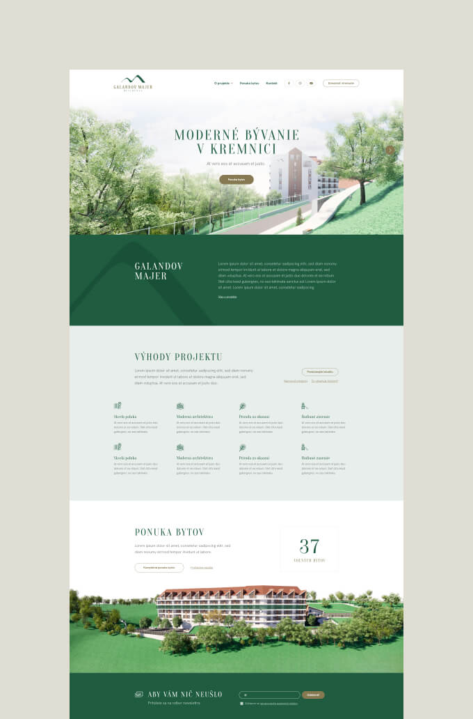
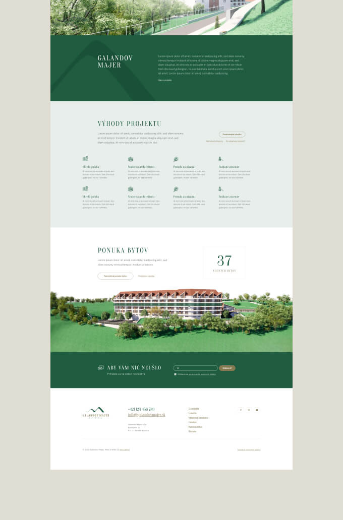
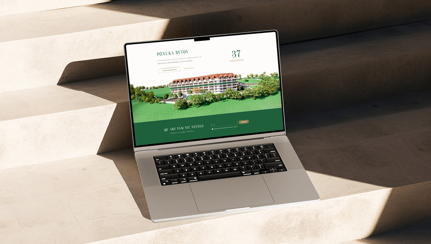
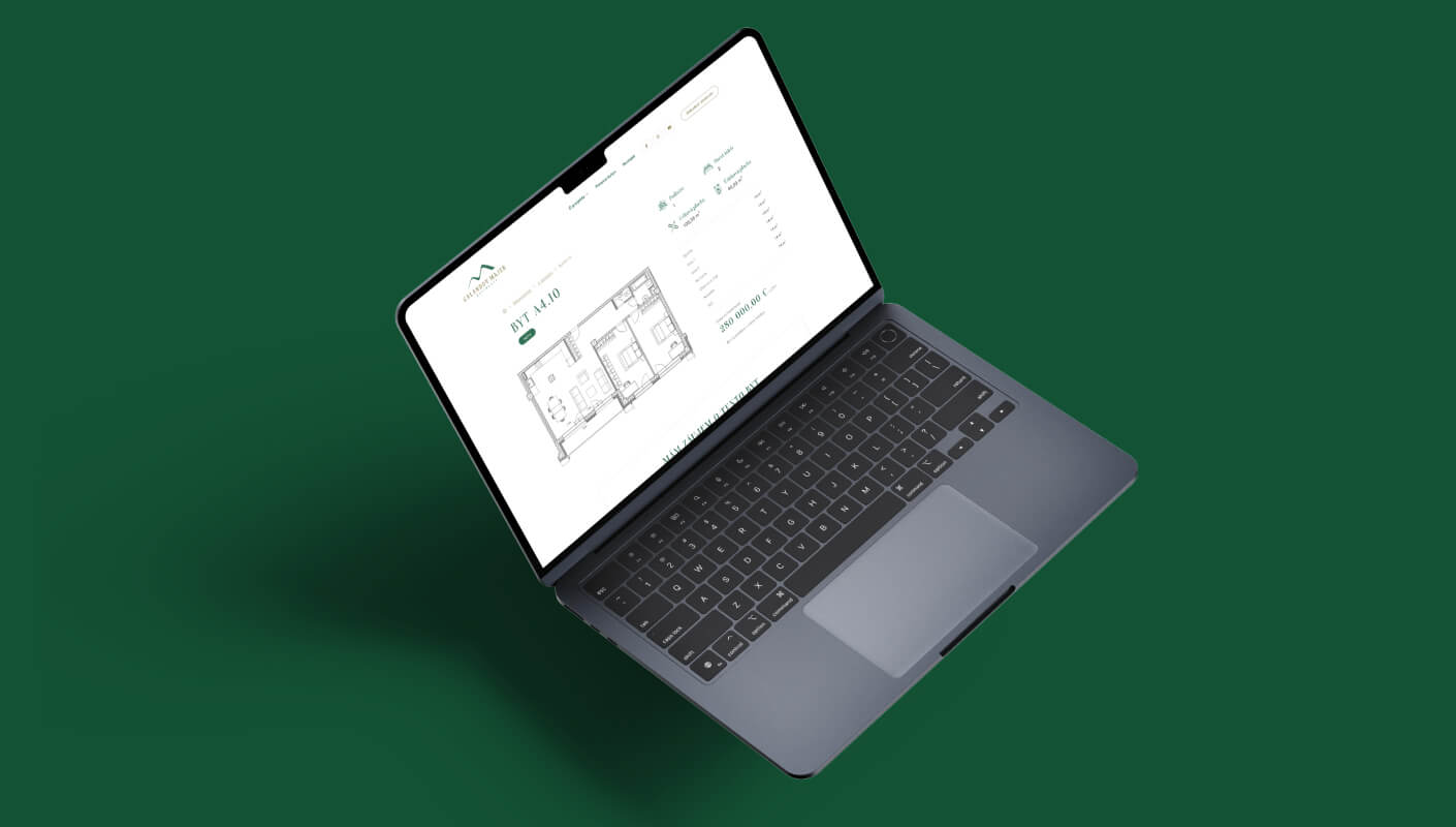
Selling a vision through architectural renders
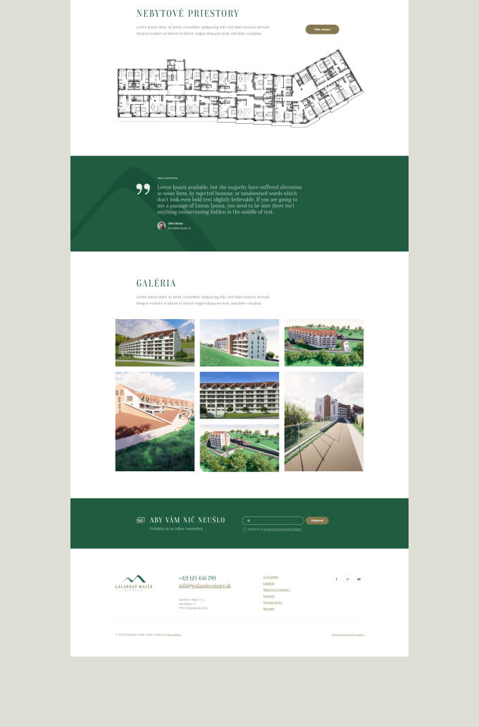
When the product doesn’t physically exist, the visual presentation carries enormous weight. Every image on the site is an architectural render showing the development as it will look when completed: the building on its hillside setting, the apartment interiors with natural light streaming through floor-to-ceiling windows, the surrounding landscape.
We designed the site to let these renders do the heavy lifting. Full-screen hero imagery, a dedicated gallery section, and carefully sized images throughout the content pages. The renders needed space to breathe. A cramped layout with small images would undercut the sense of space and quality that the development is selling.
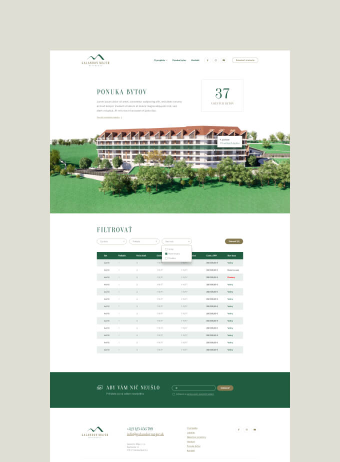
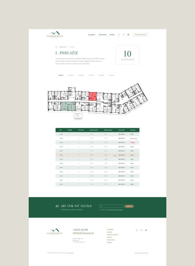
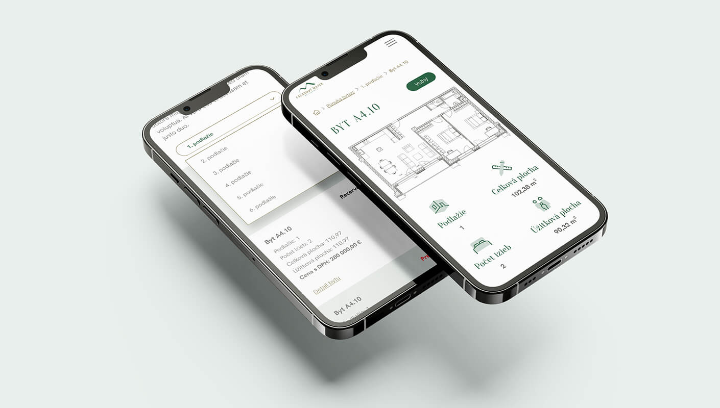
Interactive floor plans for 98 apartments
98 apartments across multiple floors is a lot of inventory to present. A simple list wouldn’t work. Buyers need to understand where in the building a specific apartment sits, what floor it’s on, and what’s available.
We built an interactive building visualisation where visitors can browse by floor. Select a floor and the site shows the available apartments on that level with their layouts and specifications. It turns a complex inventory into something you can explore naturally, the way you’d walk through a building with a sales agent pointing out options.
This is the kind of feature that separates a presentation website from a brochure PDF. The interactivity gives buyers a sense of spatial orientation within the building before a single wall has been erected.
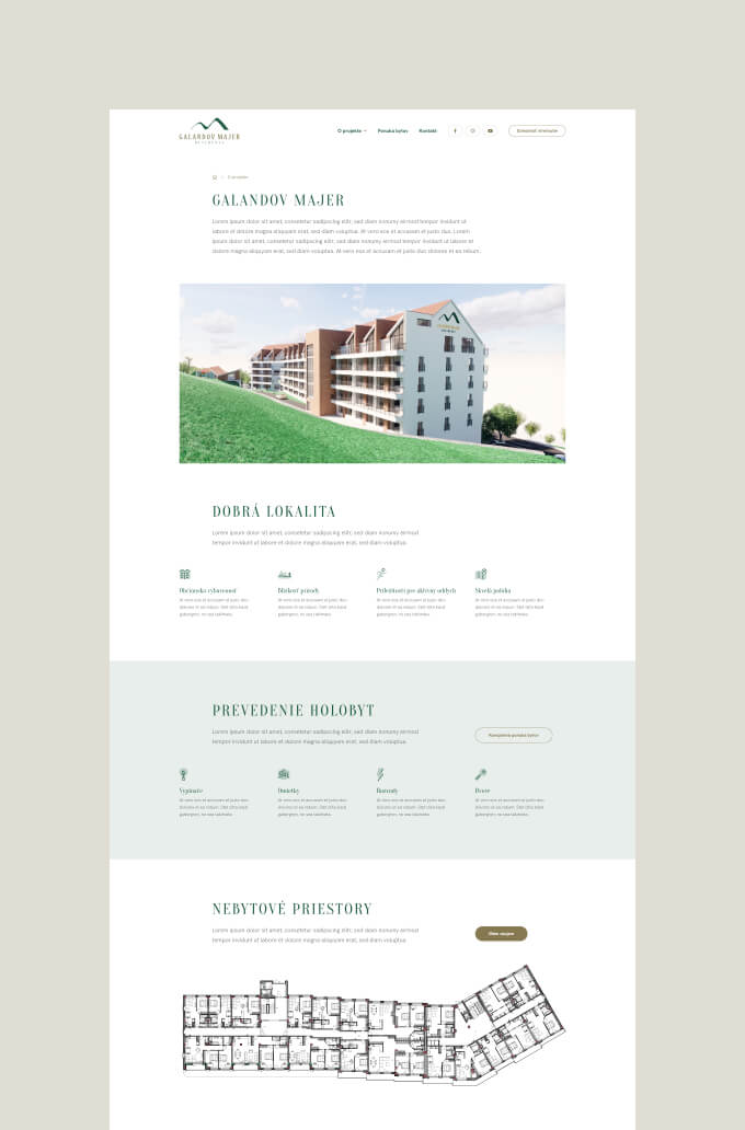
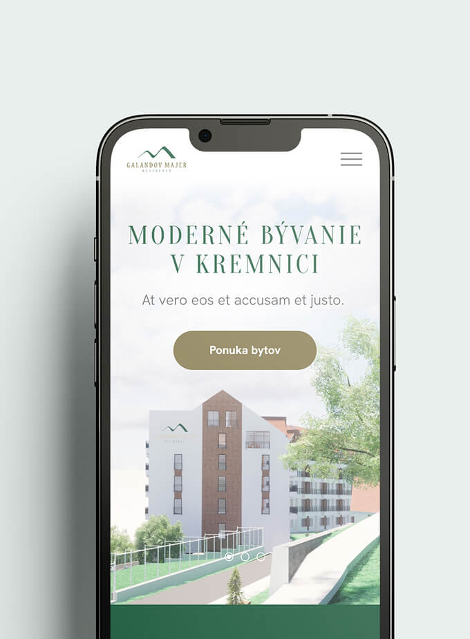
A colour palette that connects to the setting
The visual identity uses dark green and gold. That’s not an arbitrary choice. Galandov Majer sits on a wooded hillside above Kremnica, surrounded by the Kremnica Mountains. The green connects directly to the natural setting. The gold adds a premium layer that communicates quality without shouting about it.
The logo features a mountain motif, another direct reference to the location. These details might seem decorative, but they’re doing real work. A buyer considering an apartment in a mountain town wants to feel the connection to that environment. The colour palette and branding create that feeling from the first page load.
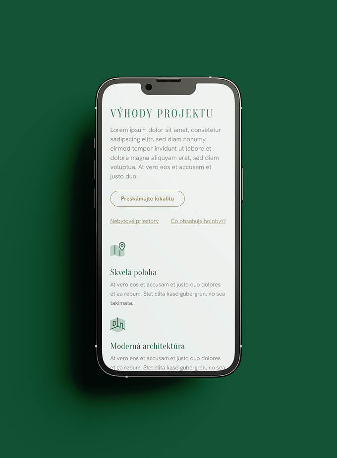
Location as a selling point, not an afterthought
For a residential development, location isn’t background context. It’s a primary purchase driver. People don’t just buy an apartment. They buy a lifestyle, a commute, a neighbourhood.
We gave the location section real prominence rather than burying it on a contact page with a map pin. The section communicates Kremnica’s appeal: the historic town centre nearby, the surrounding mountain landscape, the practical amenities (shops, schools, institutions), and the specific hillside position that gives the development its panoramic views.
This matters because Galandov Majer isn’t in Bratislava or Košice. It’s in a smaller historic town. The website needs to sell the town as much as the building.
WordPress for a sales tool that changes
Apartment inventory changes. Units sell. Prices may adjust. New phases become available. A real estate presentation website isn’t a static brochure. It’s a sales tool that the team needs to update regularly as the project progresses.
We built the site on WordPress with a content structure that makes these updates straightforward. The team can update apartment availability, adjust pricing, add new gallery images, and modify content without waiting for a developer. For a project that spans from pre-construction through to final sales, this kind of independence matters.