Employee benefits website redesign with reworked IA and warm visuals. 60+ pages, content migration, and performance tuning for a fast, scalable platform.
About the project
fpoho has long supported employers and employees in navigating the world of employee benefits, while also connecting a wide network of partners. As the company prepared for its next stage of growth, our challenge was to reshape its brand story and the structure so it reads clearly at scale. The outcome had to feel welcoming and human, without losing the operational clarity the category demands.
Reposition, then restructure
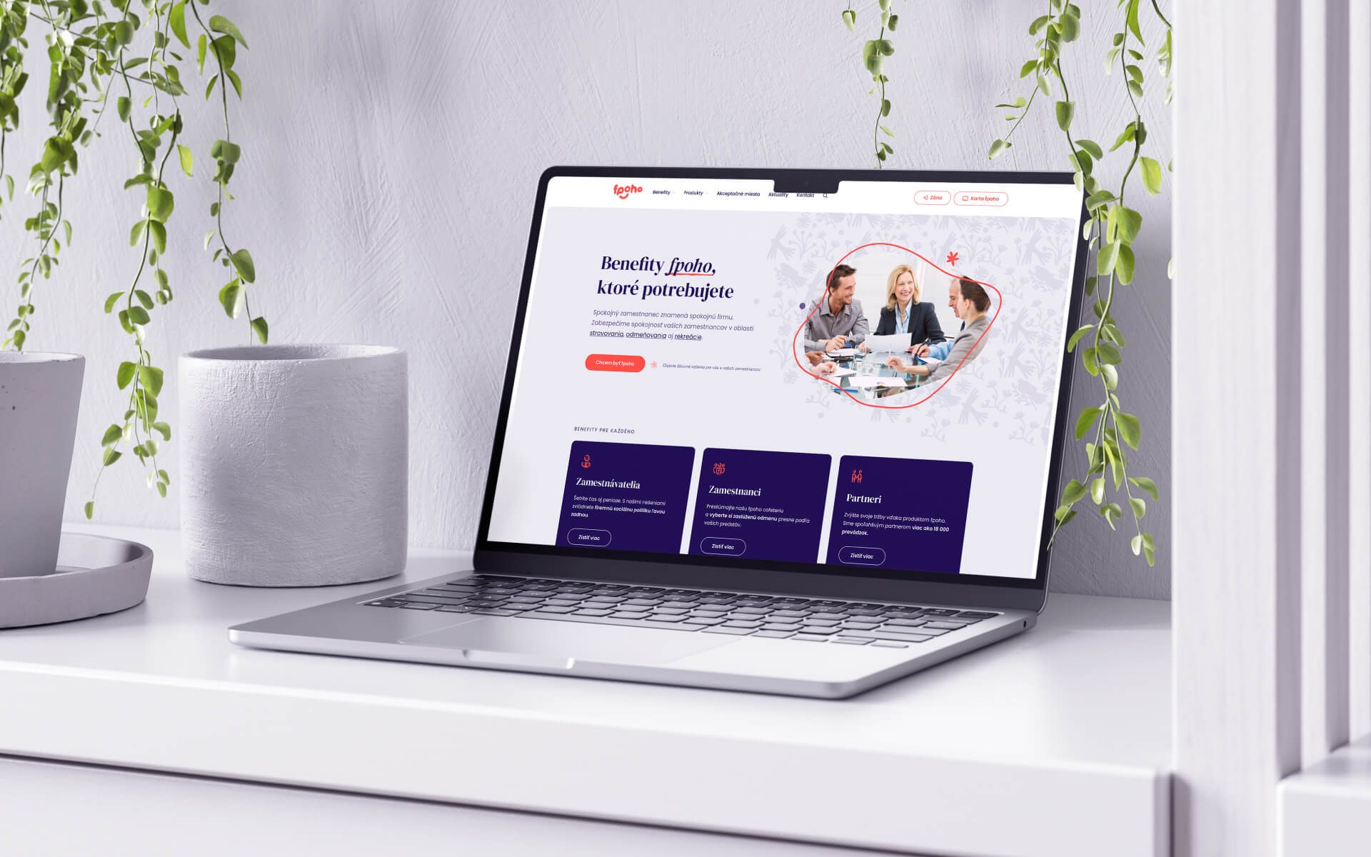
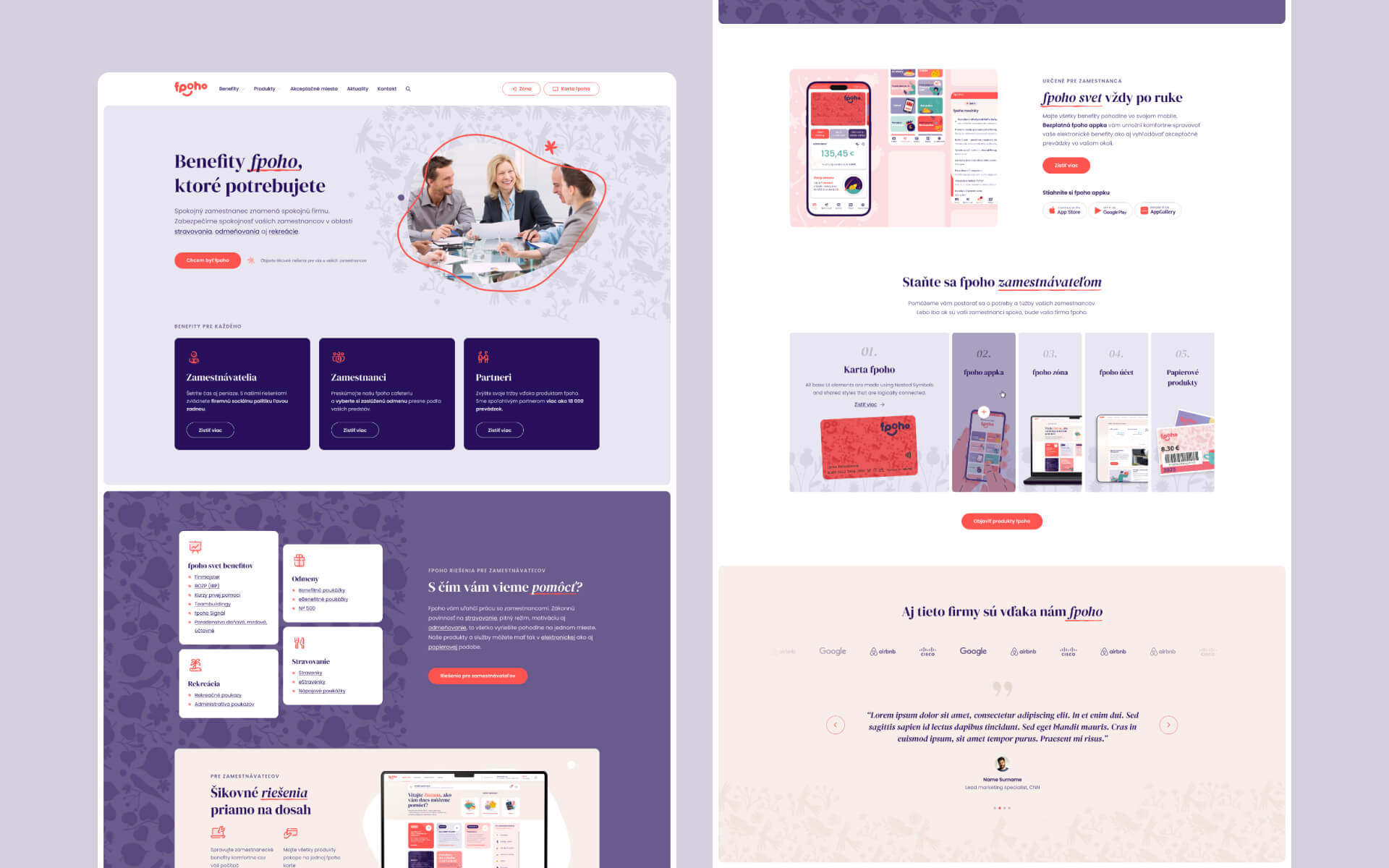
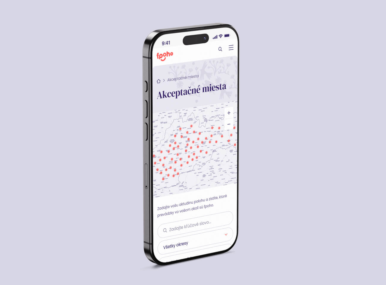
Twenty-plus separate products became a coherent system. We rebuilt information architecture and navigation around meaningful categories, mapping journeys for employers, employees, and acceptance partners. The repositioning from voucher supplier to benefits company was made tangible in the taxonomy, page models, and microcopy. A warmer visual language supported the shift: approachable color, friendly iconography, and layouts that reduce cognitive load while keeping choice visible.


"Our collaboration with okto—digital was professional and efficient. They handled our complex website build smoothly and on time. Their ability to anticipate challenges and offer quick solutions makes them a reliable and highly valuable partner."


Build & delivery
With structure approved, we designed 60+ pages, then executed the build and content program under a tight window: three months from design sign-off to launch. We migrated legacy posts, placed all new content, and tuned performance across a content-heavy footprint. The result is a fast, stable, warm-toned experience that presents fpoho’s offer. This was one of our largest scopes to date, and it works the way it reads: clear, organized, and ready to grow.


