WordPress e-commerce website design for coffee roastery Mlsnacava

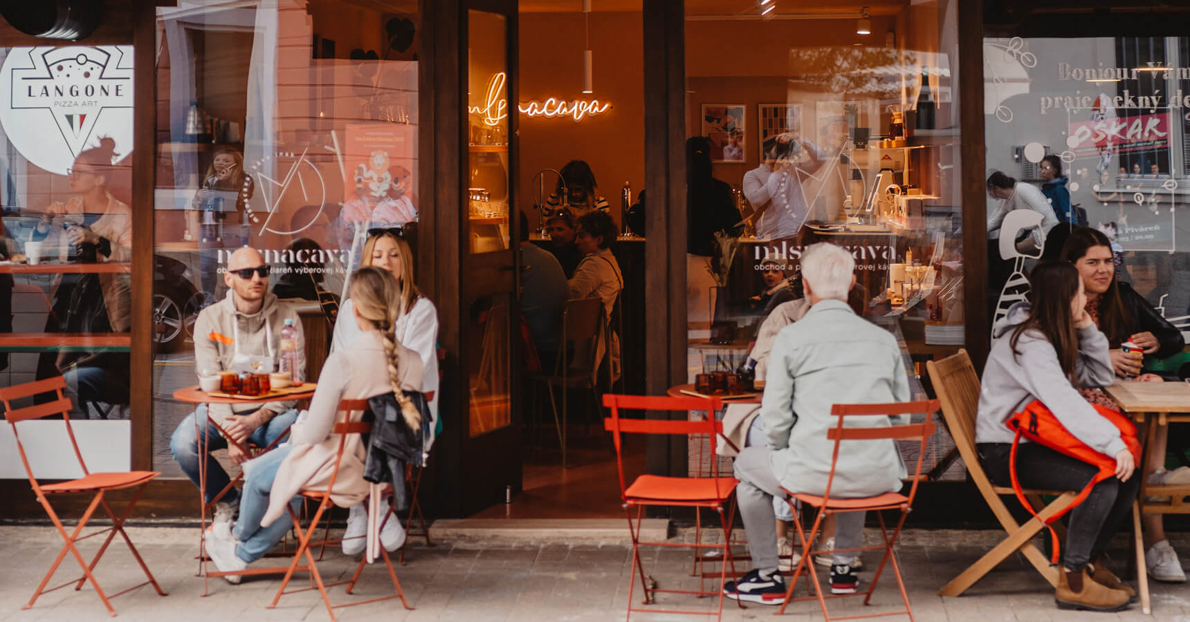
Slovakia’s only SCA-certified coffee trainers, running a business out of a 23 m² cafe

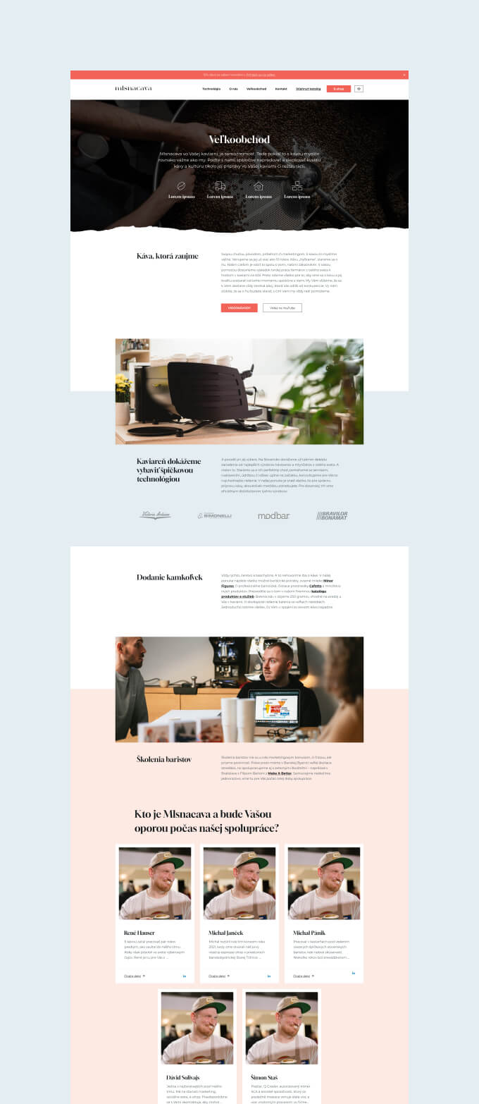
Mlsnacava isn’t a coffee shop that happens to sell beans online. They’re a specialty coffee roastery, an SCA-certified training centre, an equipment distributor, a wholesale supplier to dozens of cafes across Slovakia, and yes, they also have a tiny espresso bar in a 15th-century market building in Banská Bystrica. Twenty-three square metres, six seats.

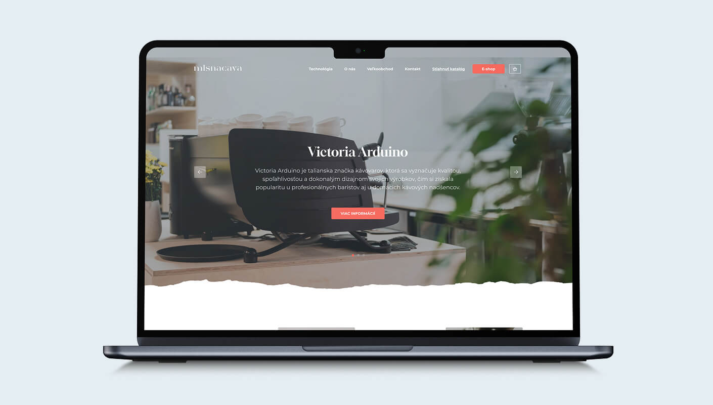
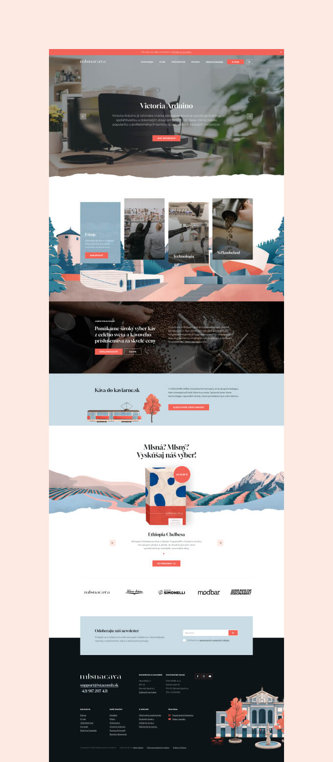
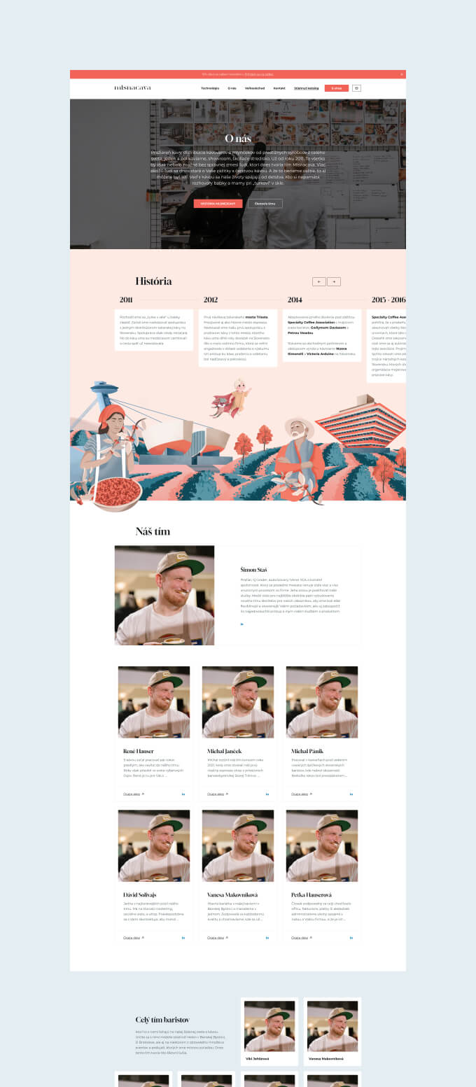
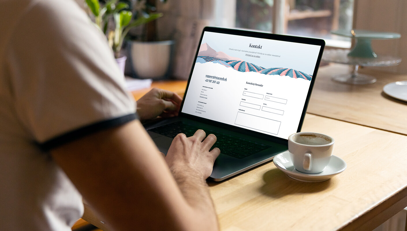
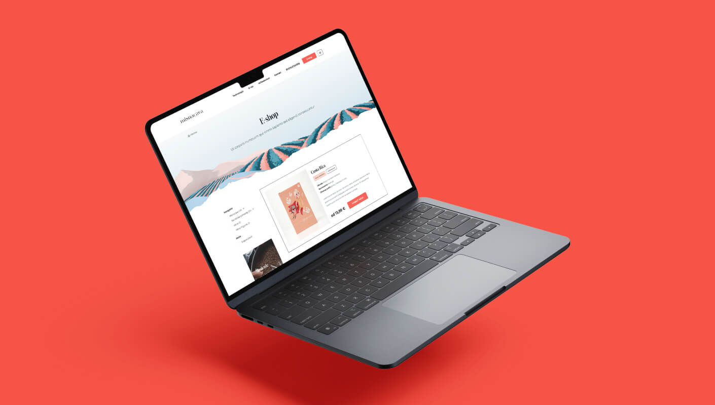
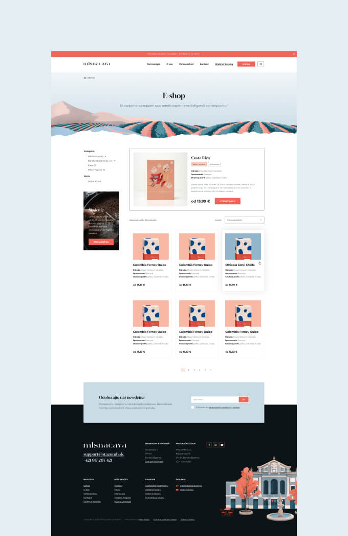
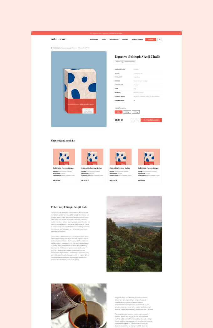
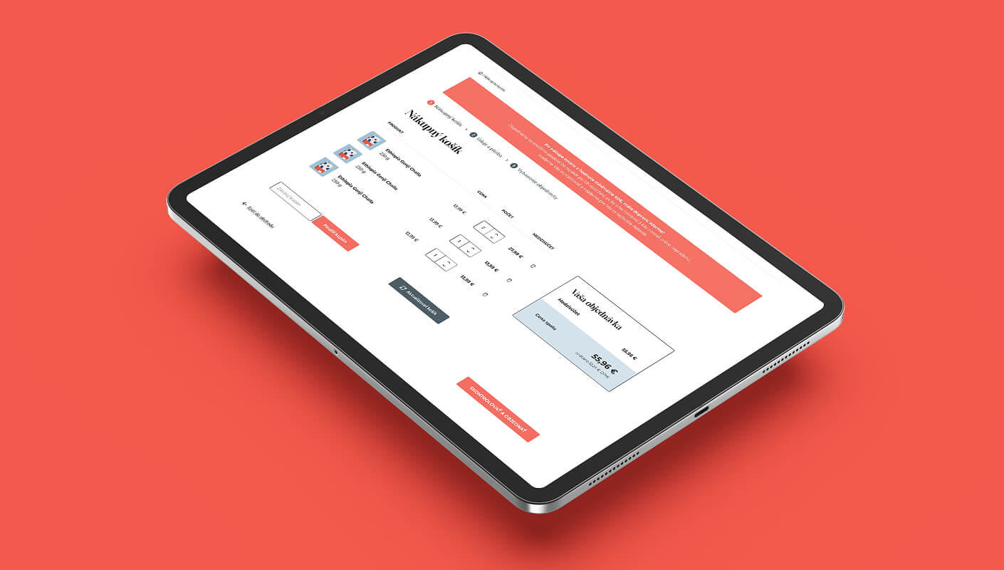
That physical space can’t show everything Mlsnacava does. The website has to.

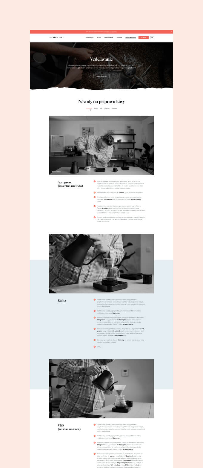
Their previous site couldn’t handle it. It didn’t communicate the breadth of their offering, didn’t sell coffee effectively online, and didn’t reflect the brand identity they’d built through their packaging and physical presence. They needed a redesign that turns a website into a proper e-commerce platform, a brand experience, and a gateway to their wholesale, training, and consulting services.

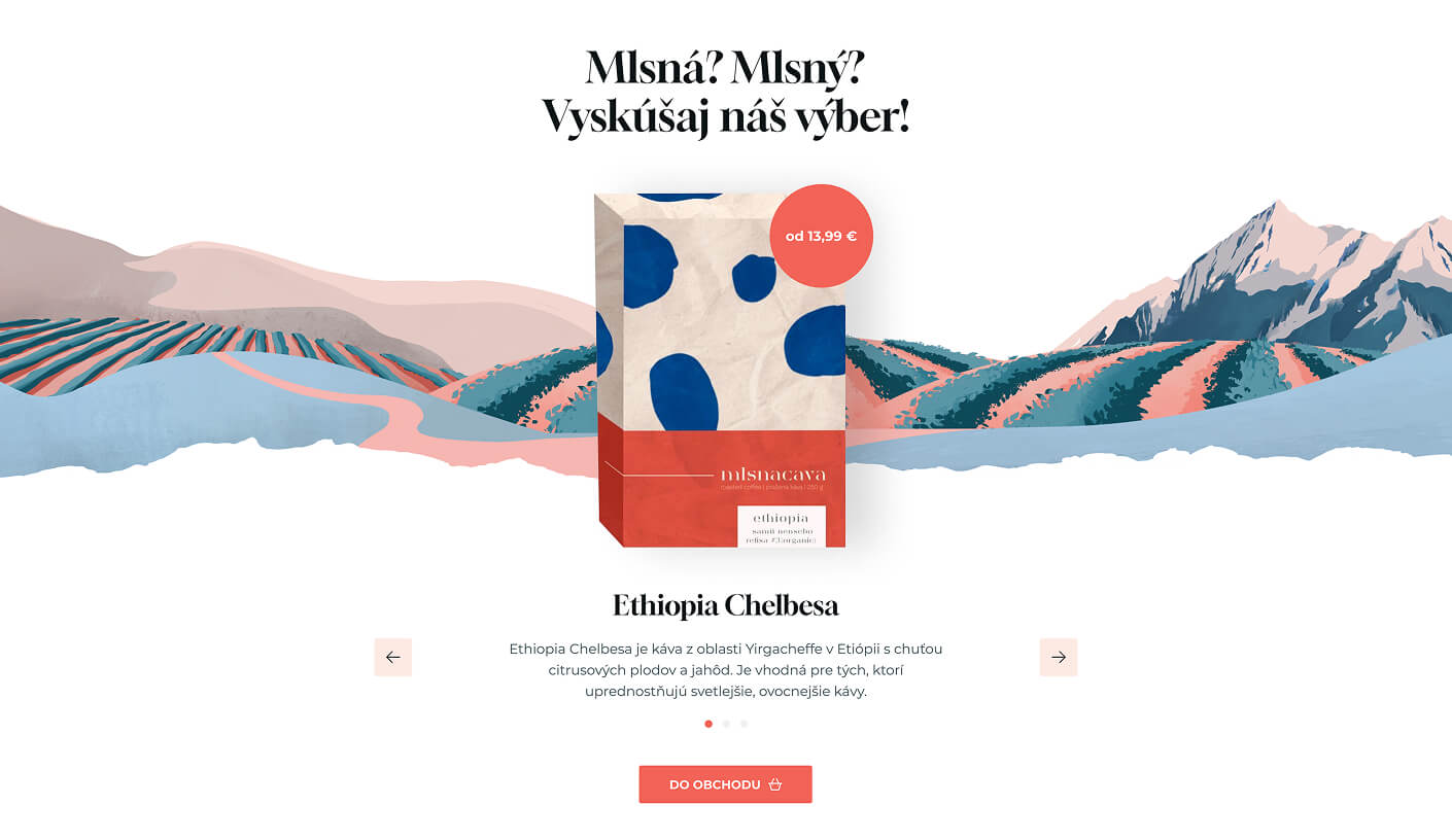
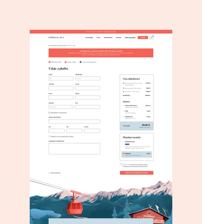
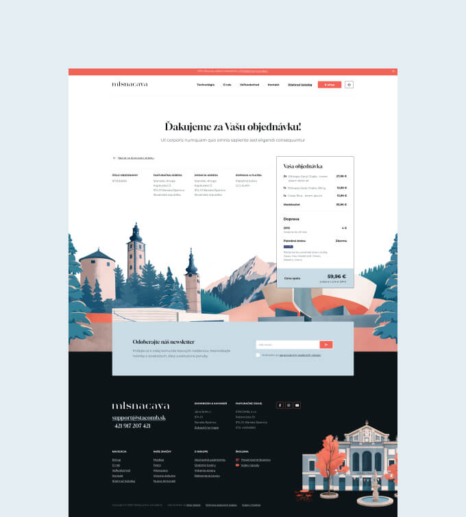
We redesigned the entire site on WordPress with a full e-commerce shop, integrated the custom illustrations from their product packaging into the web design, and built a site that serves four distinct audiences from a single, cohesive experience.

Client: Mlsnacava
Industry: Specialty coffee (roastery, wholesale, training, equipment)
Year: 2023
What we did: Website redesign, e-commerce shop, brand implementation, WordPress development

cs_mlsnacava_12

What Mlsnacava needed

Mlsnacava’s business had grown beyond what their website could present. They’d become Slovakia’s only SCA (Specialty Coffee Association) certified trainers. They’re among just three Q Graders in the country. They supply dozens of cafes with roasted coffee, distribute professional equipment from brands like Nuova Simonelli and Victoria Arduino, and run barista training programmes.

None of this came through on the old site.

The core problem was that Mlsnacava serves four fundamentally different audiences: retail customers who want to buy specialty coffee online, wholesale clients (cafes and restaurants) who need a reliable supplier, people looking for barista training and coffee education, and businesses shopping for professional coffee equipment. Each audience needs different information, different products, and a different entry point. The website needed to serve all four without turning into a cluttered mess.

On top of that, Mlsnacava had invested heavily in a visual identity built around custom illustrations of Banská Bystrica landmarks. These illustrations appear on every piece of product packaging. The website needed to carry that same visual language so the experience of receiving a Mlsnacava package at home and visiting their site felt like the same brand.

How we approached it

Illustrations that bridge physical and digital

This is what makes the Mlsnacava site visually distinctive. The product packaging features custom illustrations of Banská Bystrica’s landmarks: the clock tower, the old town market, the surrounding mountains, the roastery building. These aren’t generic coffee imagery. They’re specific to Mlsnacava’s home city, and they tell a story about where the coffee is roasted.

We took those same illustrations and built the entire website around them. The Banská Bystrica cityscape runs through the homepage as an illustrated panorama. The illustrations frame content sections, appear as decorative elements alongside photography, and carry through to details like the custom 404 page (which features its own illustrated character).

The result is a site where the visual language is unmistakably Mlsnacava. You see a coffee box at a friend’s house, visit the website, and the connection is immediate. That kind of brand consistency between physical product and digital experience is rare, and it only works because we built the website design around the existing illustration system rather than treating illustrations as decoration.

A colour palette with personality

Mlsnacava’s brand palette centres on coral, cream, and teal. It’s warm, approachable, and immediately distinguishable from the dark, moody aesthetic that dominates specialty coffee branding. Most roasteries go with dark backgrounds and gold accents. Mlsnacava goes with illustrated landmarks and a colour scheme that feels more like a travel poster than a coffee shop.

That’s a deliberate positioning choice, and we carried it through every element of the site. The coral appears in CTA buttons, the announcement bar, and hover states. The cream backgrounds give the illustrations and photography space to breathe. The teal in the illustrations provides contrast without competing with the coral accents.

The visual effect is a site that feels genuinely different from other specialty coffee websites. It has personality. When your brand identity is this strong, the website’s job is to amplify it, not reinvent it.

"okto—digital delivered a fantastic new website and e-shop for Mlsnacava, perfectly capturing the atmosphere of our physical store and strengthening our online brand identity. The optimized, user-friendly e-shop makes coffee ordering convenient, and we are thrilled with how effectively it communicates our story and services."

simon-s
Šimon Staš — CEO @ STACOMB s.r.o.

The website

Four audiences, one website

The navigation had to handle a business that’s simultaneously a shop, a wholesale supplier, a training provider, and an equipment distributor. That’s four different audience paths.

We structured the site so each audience finds their entry point quickly. The main navigation separates the key sections: Technológia (equipment), Veľkoobchod (wholesale), the E-shop, and the educational content. A wholesale buyer doesn’t need to scroll past retail coffee prices to find B2B information. A home coffee enthusiast doesn’t need to wade through commercial espresso machine specifications.

The homepage acts as a hub, presenting all four facets of the business with clear pathways into each. Category cards guide visitors to wholesale, education, technology, and the blog. It’s a lot of business to fit into one site, but the structure makes it navigable rather than overwhelming.

Newsletter and conversion built in

The site includes conversion elements that work without being pushy. A newsletter popup offers a 10% discount for subscribers (a proven e-commerce tactic). The announcement bar promotes the newsletter offer persistently. Product pages include clear add-to-cart functionality. A downloadable product and services catalogue serves as a lead magnet for wholesale prospects.

These aren’t afterthoughts bolted onto a pretty design. They’re integrated into the experience from the start, designed to match the brand’s visual language and tone. The popup uses the product packaging imagery. The CTAs use the coral brand colour. Everything looks like it belongs.

An e-commerce shop built for coffee

Selling coffee online isn’t like selling t-shirts. Each product has specific information that buyers care about: the origin country, the farm or cooperative, the coffee variety (Red Bourbon, Castillo, Red Catuaí), the processing method (washed, natural, honey), and the roast profile. Specialty coffee customers read this information. It affects their purchase decision.

We built the product pages to present this information clearly. Each coffee listing shows variety, processing, and origin alongside the product image and price. Category filtering lets visitors browse the full range (currently 20 products) or narrow down to what they’re looking for. The checkout process is streamlined to reduce friction between “I want this coffee” and “it’s on its way.”

The e-commerce side runs on WordPress with WooCommerce, which gives the Mlsnacava team full control over product listings, pricing, and inventory. When a new single-origin arrives from Ethiopia or Colombia, they can add it to the shop without waiting for a developer.

Explore more work