WordPress website design for TruPoint

When your clients trust you with their security, your website can’t look like it was built in 2015

For a managed IT services provider, the website isn’t just a marketing tool. It’s the first trust test.

TruPoint is a Canadian managed services provider that handles secure, compliant, work-from-anywhere IT for businesses in finance, insurance, law, and manufacturing. They protect data. They maintain SOC II and HIPAA compliance. They run private cloud infrastructure across certified data centres.

And their old website didn’t reflect any of that.

They were going through a major rebrand and needed a website that matched the level of trust their 150+ clients already placed in them. We designed and built it on WordPress, starting with wireframes and ending with a clean, modern tech website that communicates security without feeling cold.

Client: TruPoint Technology Services Ltd.
Industry: Managed IT services (cloud, security, compliance)
Year: 2022
What we did: Wireframes, website design, WordPress development

cs_trupoint_main

What TruPoint needed

TruPoint wasn’t a startup looking for a first website. They had 150+ customers and 1,500+ users relying on their platform daily. Their services (TruWorkspace™, TruOffice™, TruSync™, and others) are enterprise-grade solutions powered by Citrix, running on geographically redundant private cloud infrastructure.

The problem was that their website didn’t tell that story.

They were rebranding, and the new website had to do several things at once: communicate deep technical capability without overwhelming a non-technical audience, build trust with security-conscious industries like finance and insurance, and make a complex service portfolio (eight branded products) feel organised and navigable.

That’s a design challenge most template themes can’t solve.

How we approached it

Wireframes to handle the complexity

TruPoint’s service offering is broad. Cloud desktops, managed IT, file sharing, penetration testing, fractional CISO, network solutions, plus cloud-hosted editions of QuickBooks, Sage, and Ascend. Getting all of that into one website without it feeling like a phone book required careful structural planning.

We started with wireframes. Every page and section got mapped out before any visual design work began. The navigation structure alone needed significant thought: how do you distinguish between “Services” (the products) and “Solutions” (the use cases) without confusing visitors?

The wireframes solved that early, when moving things around costs nothing.

The website

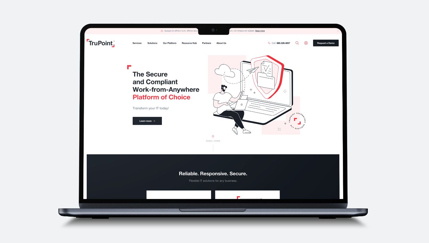
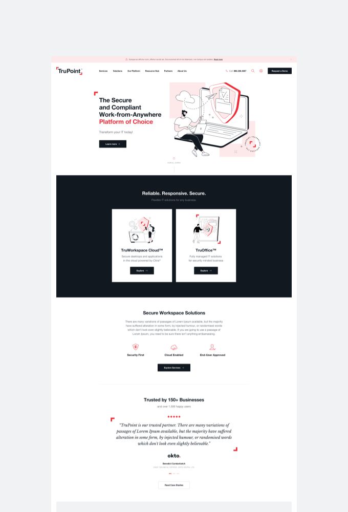
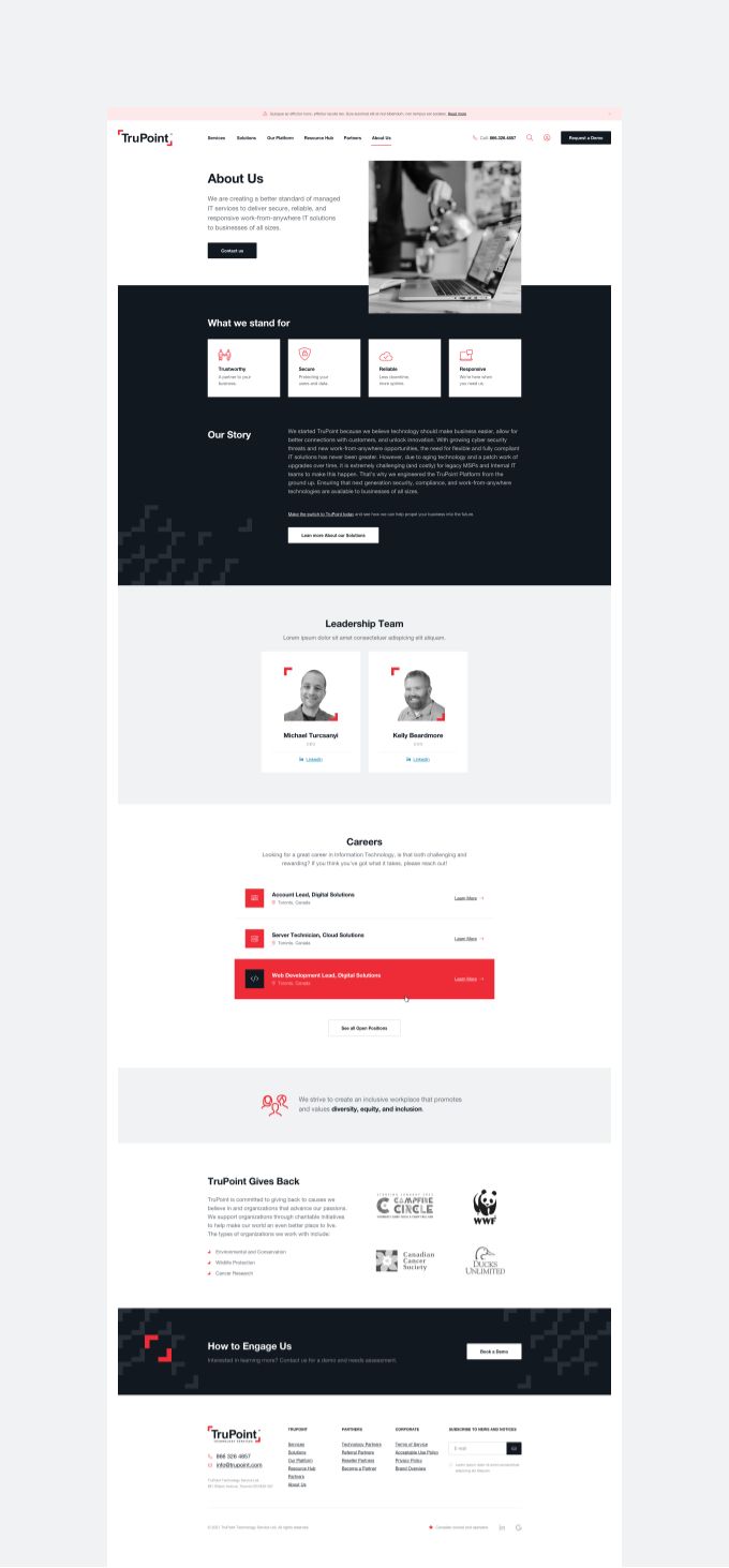
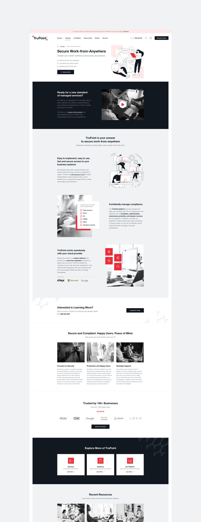
A design that says “we protect your data” without saying it

For an IT security company, the visual design carries weight. The wrong aesthetic and you look either too corporate and unapproachable, or too casual for a company handling SOC II compliance and HIPAA-regulated data.

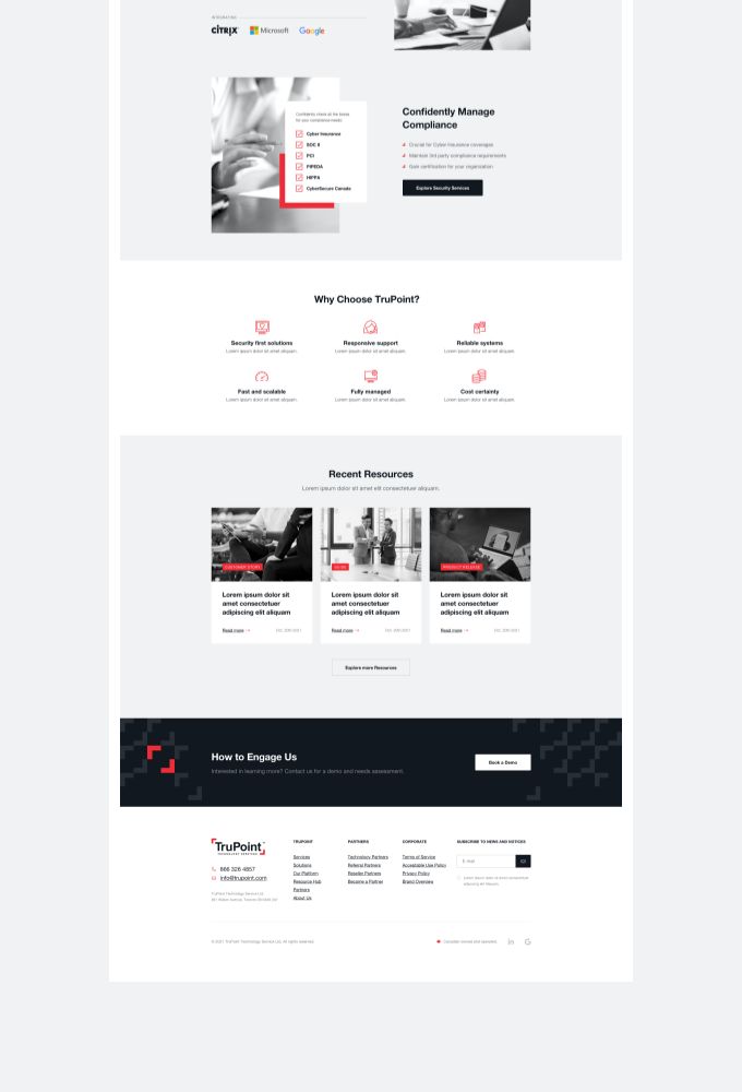
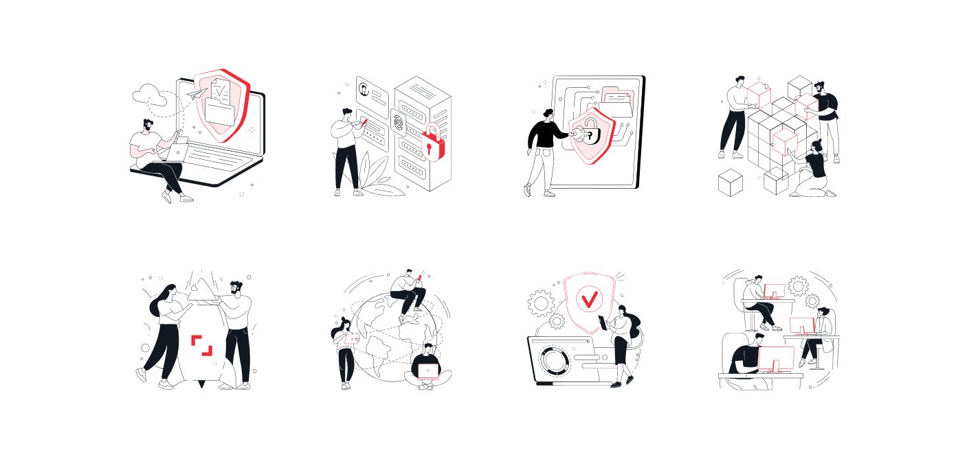
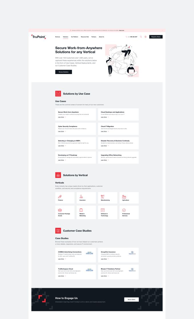
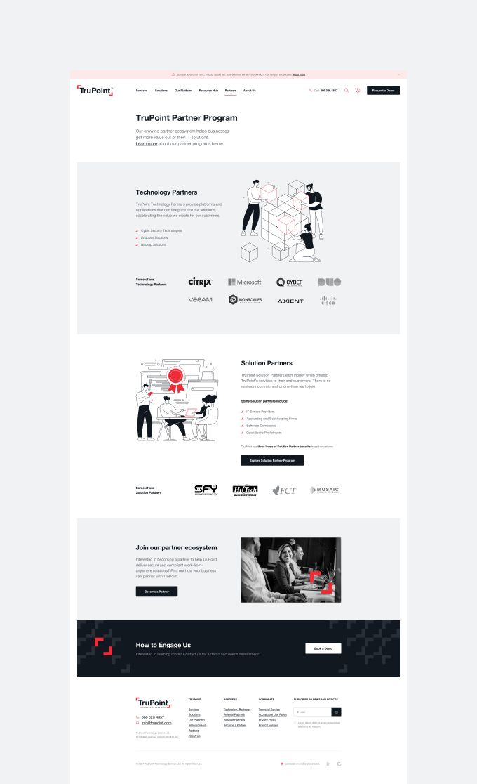
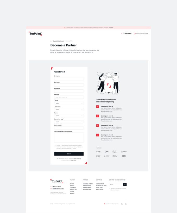
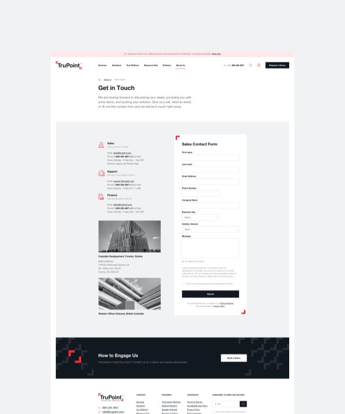
We went with a clean, modern tech aesthetic. Dark tones that communicate professionalism and security. Carefully selected imagery and custom illustrations modified to fit TruPoint’s specific service offerings. The design feels current and trustworthy, which is exactly what their audience (IT decision-makers at mid-size companies) needs to see.

Every visual choice reinforced TruPoint’s core values: trustworthy, secure, reliable, responsive.

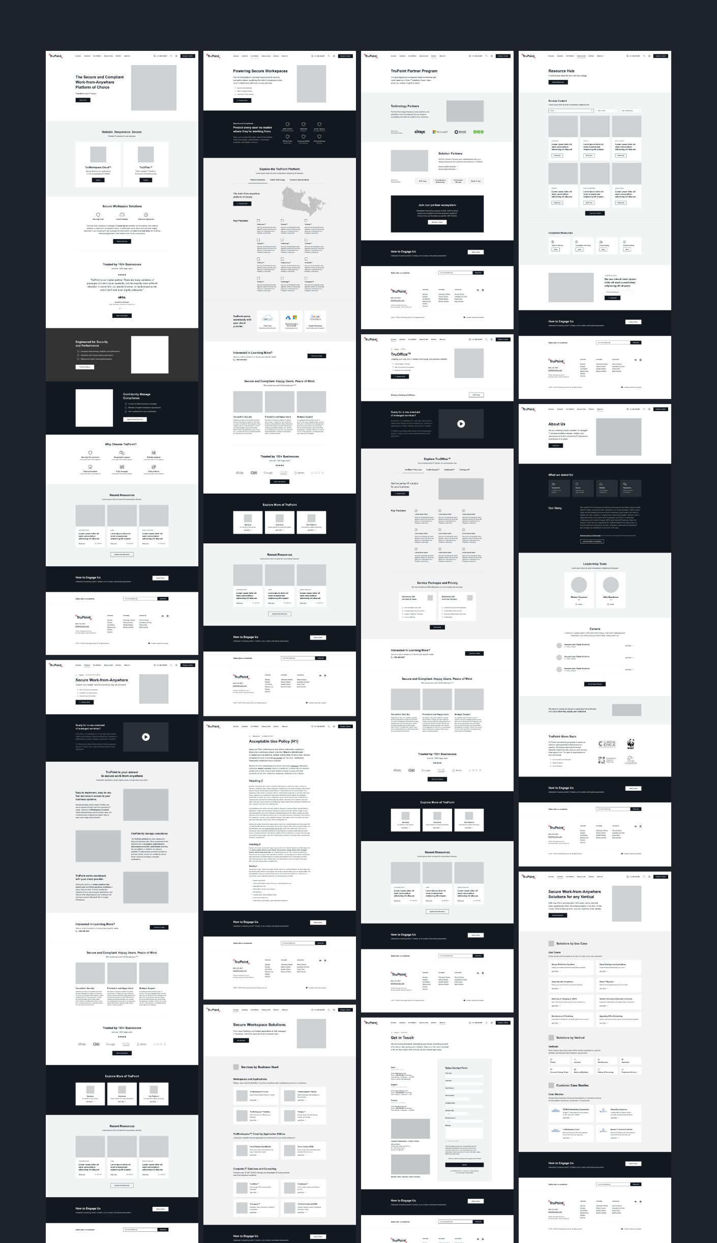
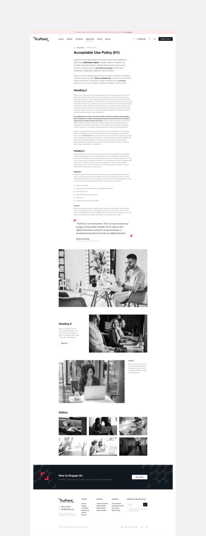
Built on WordPress for content control

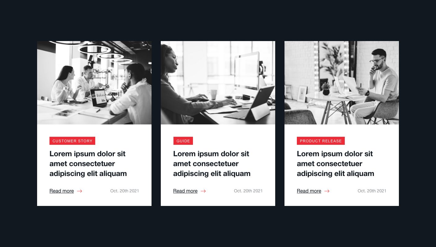
TruPoint’s team needed to manage their own content. Blog posts, resource hub articles, service updates, career listings. They’re an active company that publishes regularly, and they shouldn’t need a developer every time they want to update a page.

WordPress was the right fit here. It gives TruPoint full control over their content while supporting the custom design and functionality their site requires. The resource hub, careers section, and partner programme pages all run through WordPress, making updates straightforward for their team.

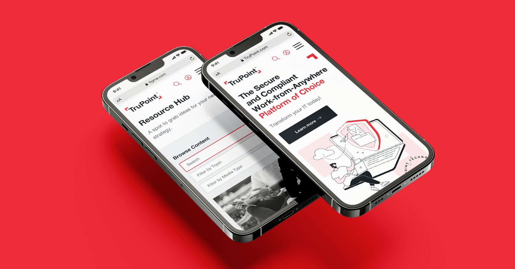
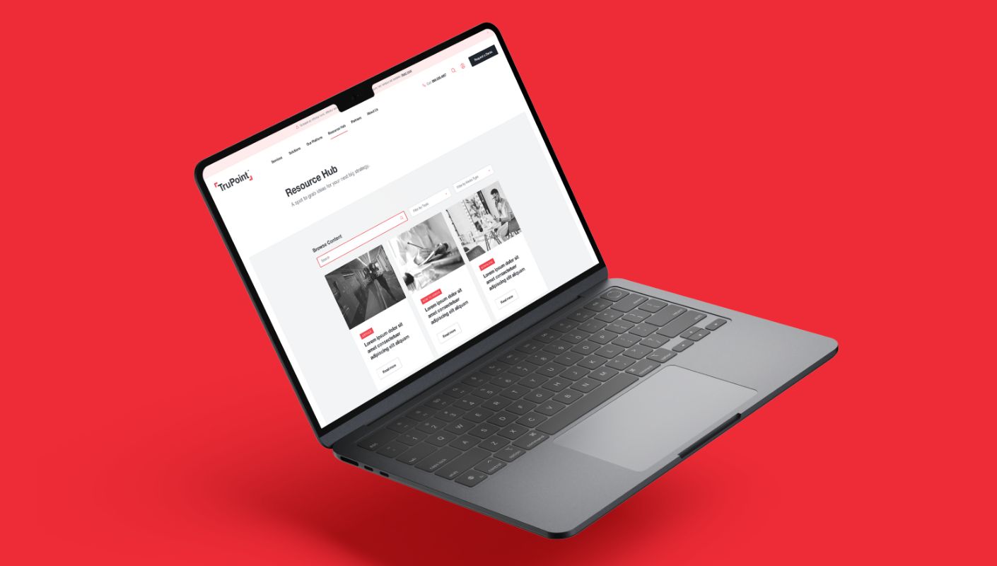
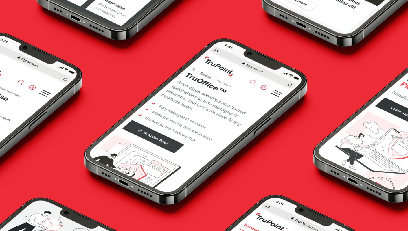
Responsive across every device

TruPoint’s audience includes business owners, IT managers, and C-suite executives. These people check websites between meetings, on tablets during travel, and on phones during lunch. The site had to work everywhere.

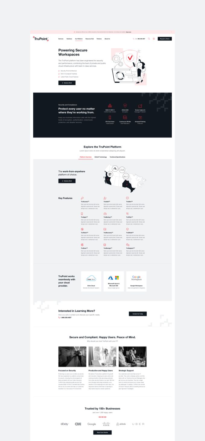
We designed with multiple screen sizes in mind from the start. The navigation (which is complex given the number of services and solutions) collapses cleanly on mobile. The testimonial carousel, compliance badges, and service grids all adapt without losing clarity or functionality.

"The team at okto—digital helped us transform our website during a major rebrand of our company. They brought our vision to life through an easy, and flexible design process and went above and beyond so we could launch successfully! I highly recommend them."

trupoint-ceo-michael-t
Michael Turcsanyi — CEO @ TruPoint
Explore more work