Custom built website and technical solution for a FARMI – PROFI company, that focuses on continuing education in medicine and pharmacy.
About the project
This project was highly complex, with a lengthy list of specific client requirements that encompassed the entire automation process. Our team was tasked with selecting the appropriate development stack to cover both the front-end and back-end aspects of the project. We worked diligently to identify the best technologies and tools for the job, ensuring that they met the client’s needs and specifications.
Despite the technical challenges, we remained focused on delivering a high-quality product that effectively fulfilled the client’s objectives. The end result was a robust and efficient automation system that exceeded the client’s expectations and delivered significant value to their business.
Wireframes
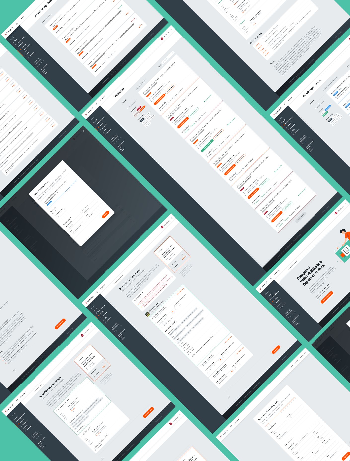
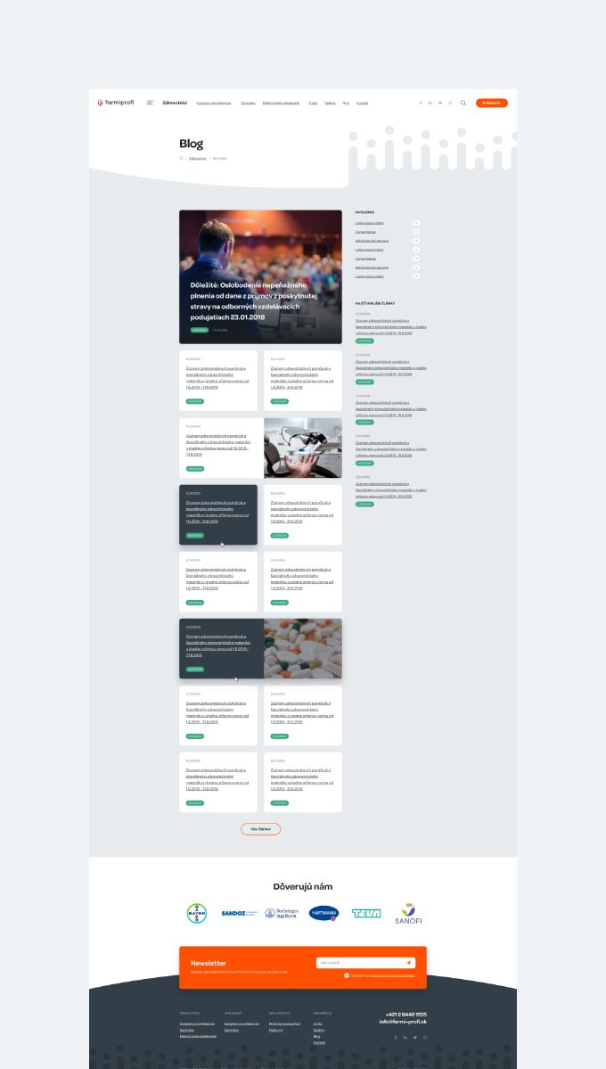
To ensure that we could meet the client’s current and future requirements, we began the project by creating a comprehensive set of wireframes. This allowed us to identify and address any potential challenges before beginning the actual development process.
The wireframes helped us to map out the site structure, functionality, and user interface in detail, providing a clear roadmap for the project. By taking a proactive approach, we were able to future-proof the client’s requirements, ensuring that the site would be scalable and adaptable as their business grows.
The wireframing process allowed us to identify and mitigate potential risks and challenges, resulting in a smoother development process and a more effective end product.

Website
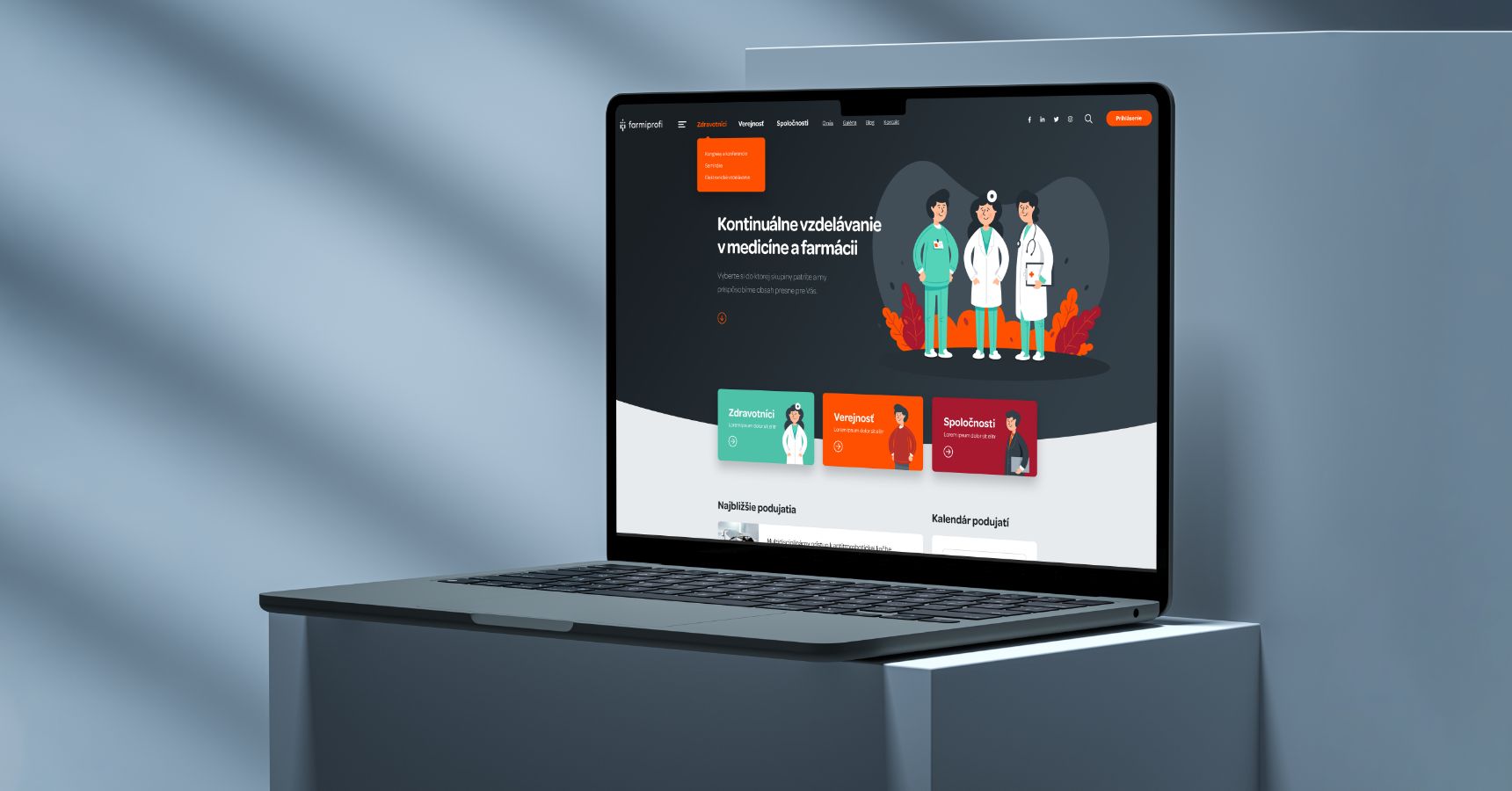
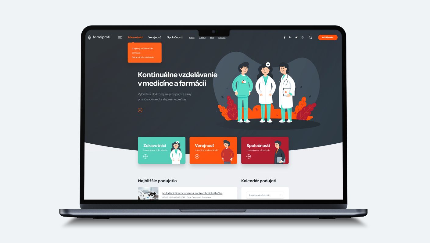
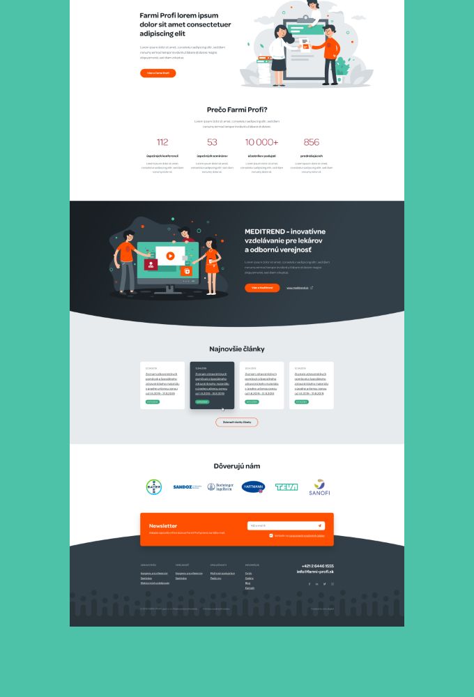
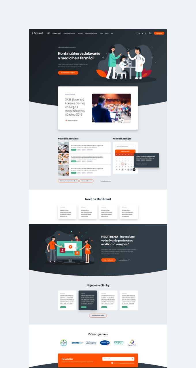
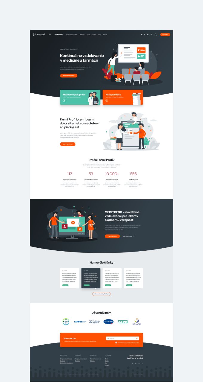
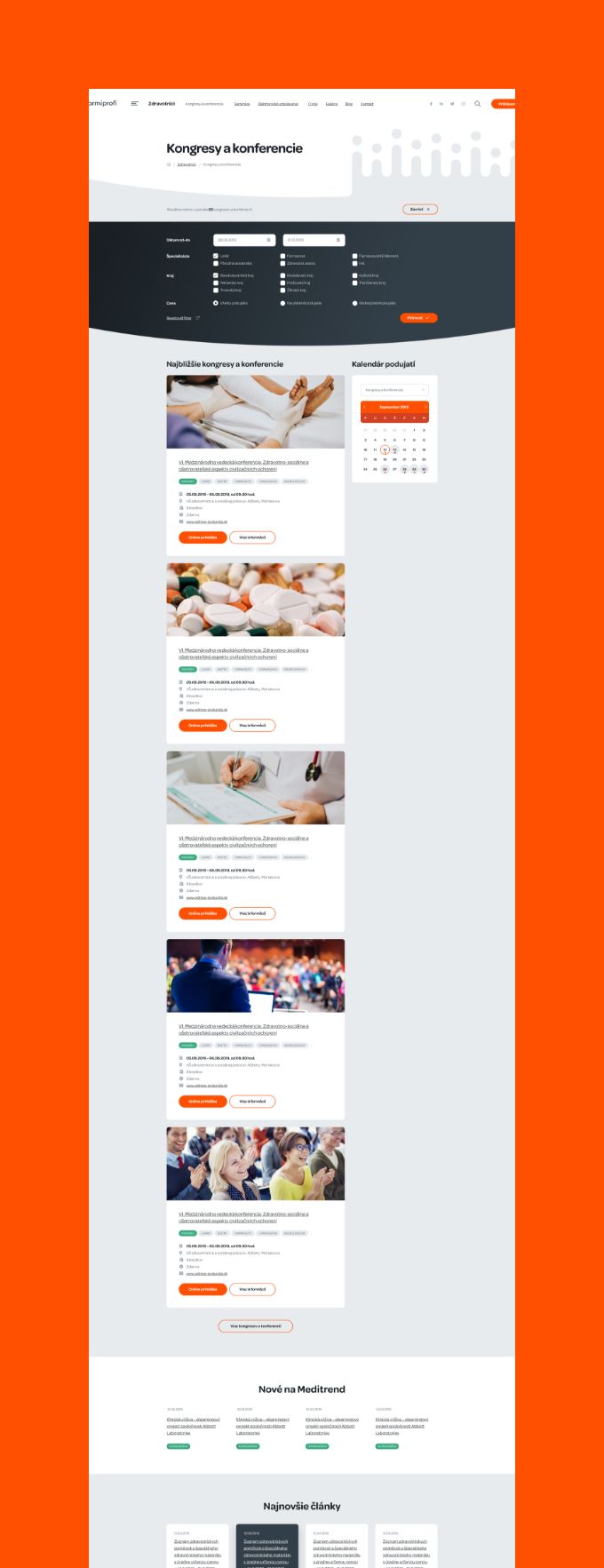
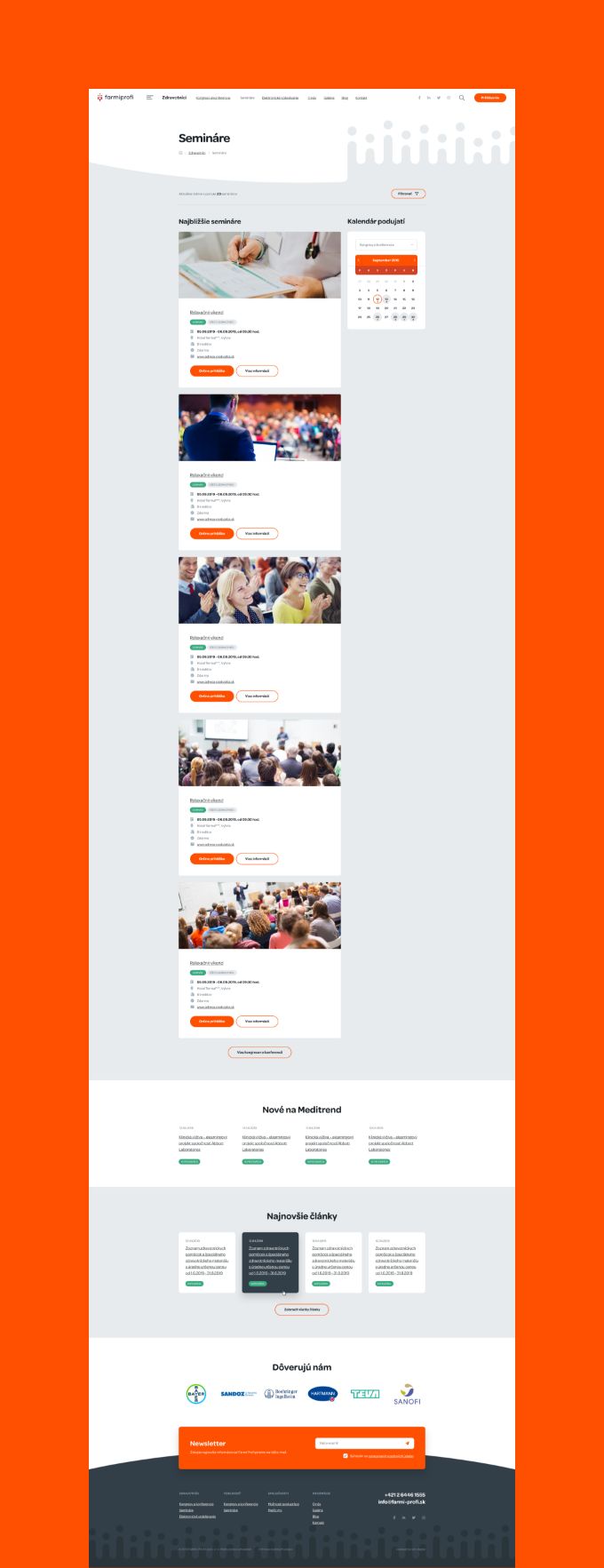
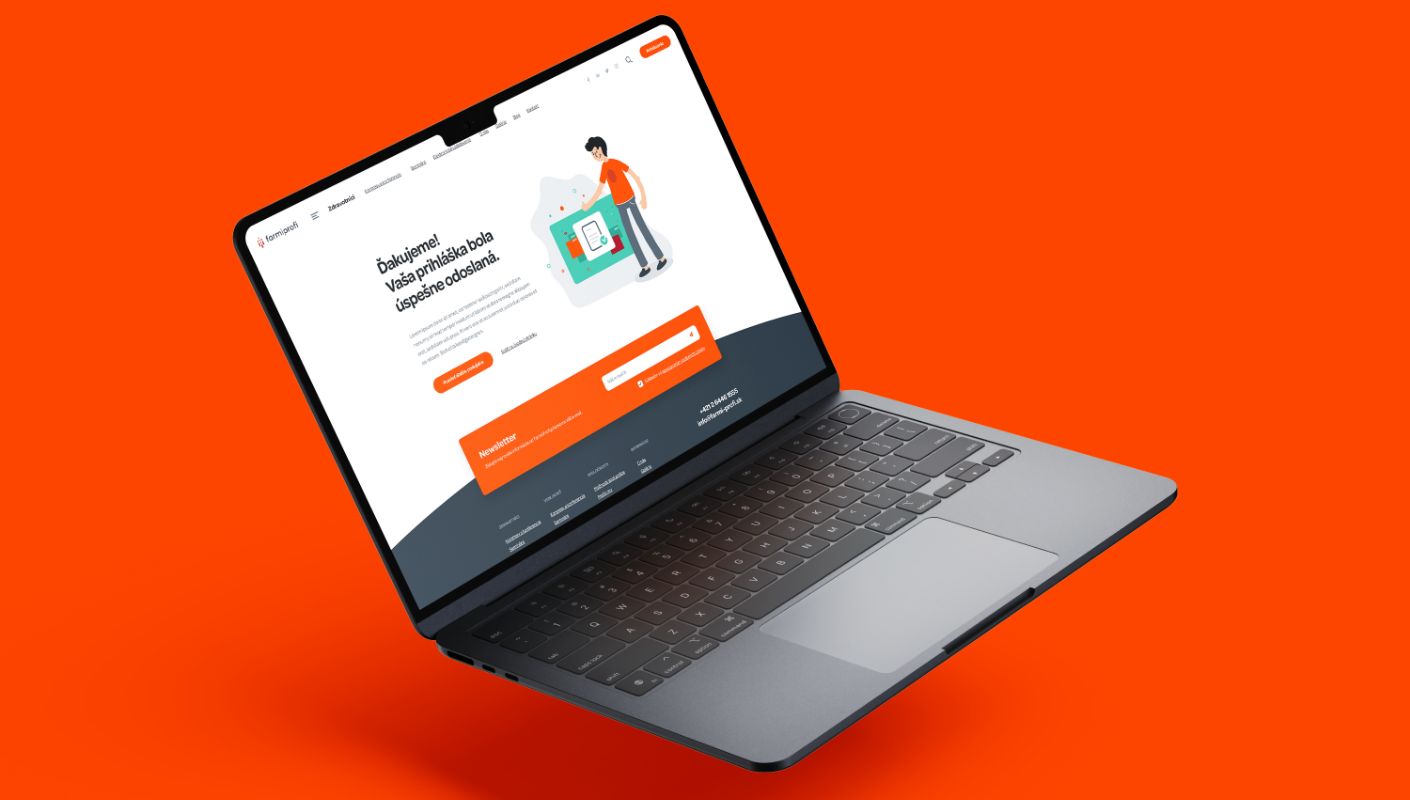
The client had a specific visual requirement for the website design, which involved incorporating illustrations with a medical background. However, the client also emphasized the importance of maintaining a professional and polished appearance.
Our team worked diligently to strike a balance between the two, creating illustrations that effectively conveyed the client’s message while also adhering to their brand identity and messaging.
We carefully selected each illustration, ensuring that they were not only visually engaging but also appropriate for the content they were paired with. The end result was a website design that effectively balanced the client’s visual requirements with their need for a professional appearance, delivering an engaging and visually stunning experience for site visitors.





"Cooperation with okto—digital on a demanding project was at a very high level. We value professionalism, approach, reliability, fairness and willingness to quickly process requested changes. We are planning several larger projects in the future and we already know who to turn to."

B2B member zone
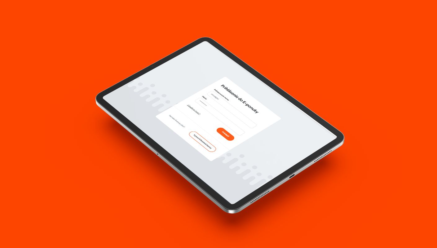
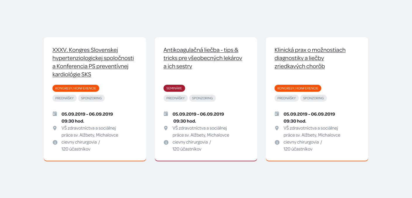
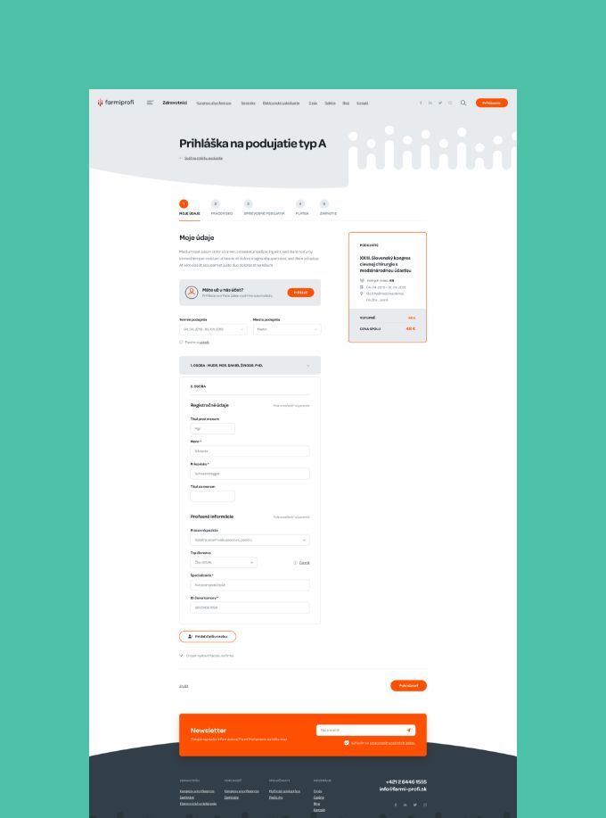
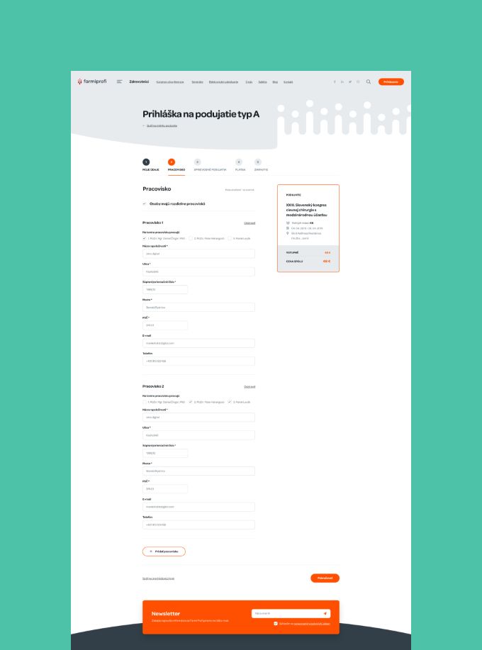
The most challenging aspect of the project was the development of a B2B member zone, which allows the client to create and manage events – both online and offline – as well as handle visitor registration, speaker registration, accommodation and third-party service bookings.
Visitors are notified of changes to their reservations and can update their profile information and pay registration fees online, either via credit card or wire transfer.
All of this data is interconnected with the client’s invoicing solutions and payment gateways, as well as their marketing tools, including newsletters and social media platforms. Our team worked diligently to ensure that the member zone was user-friendly and efficient, delivering an exceptional experience for both the client and their visitors.
The result was a comprehensive and streamlined system that effectively meets the client’s needs and expectations.
