WordPress website design for golf resort Tri Duby Golf

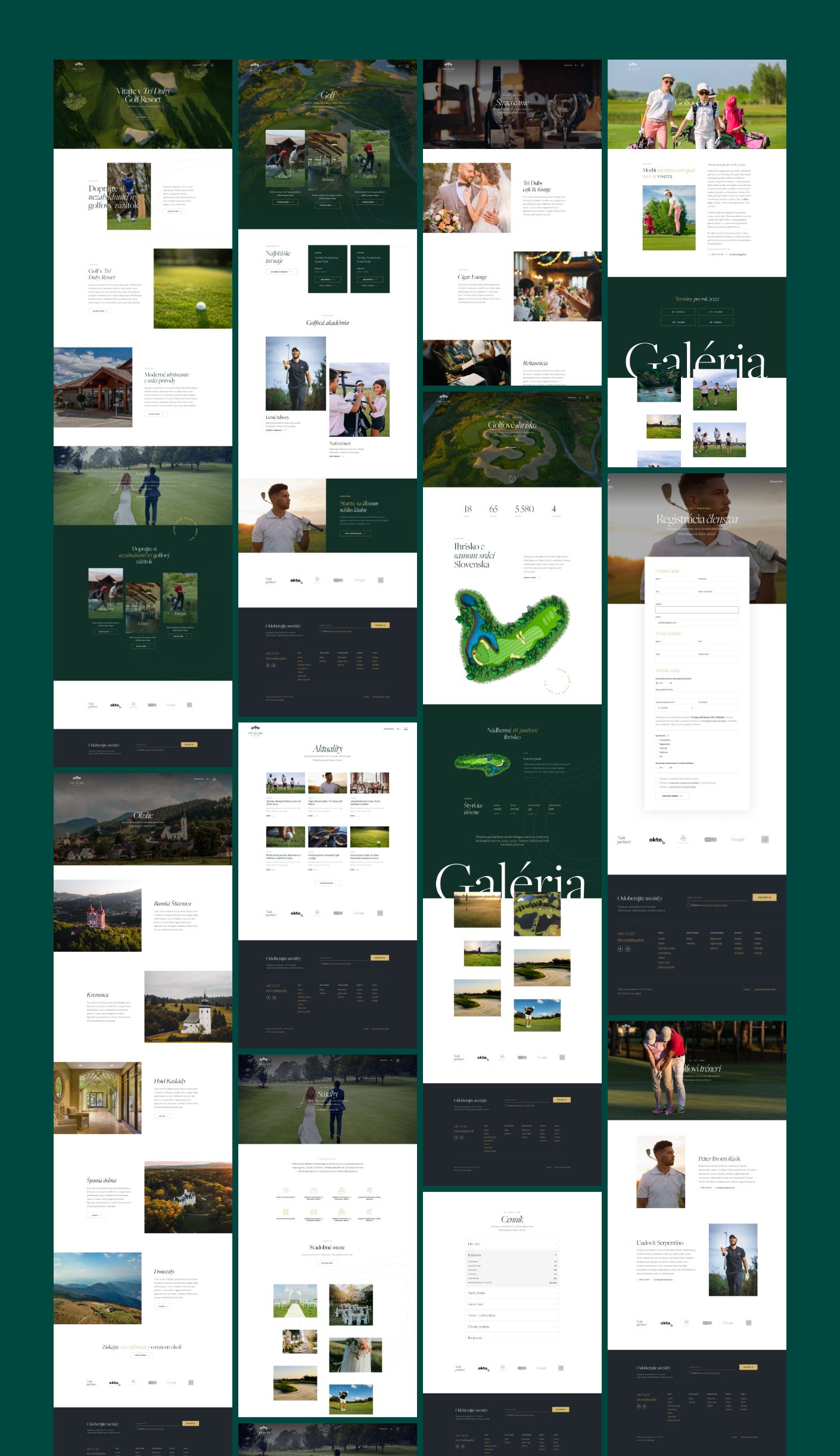
Eighteen holes, a restaurant, six hotel rooms, and a real estate development. One website.

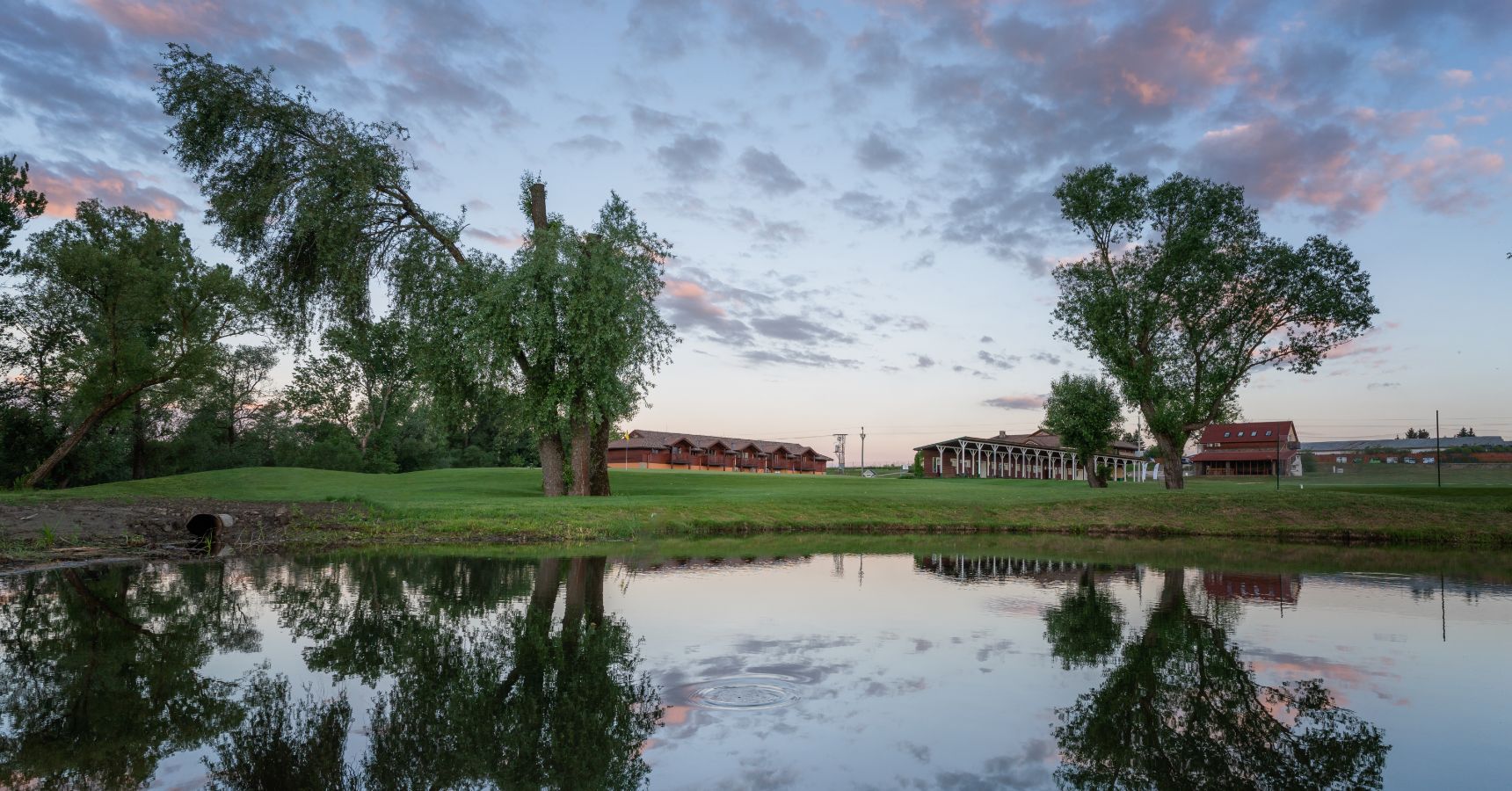
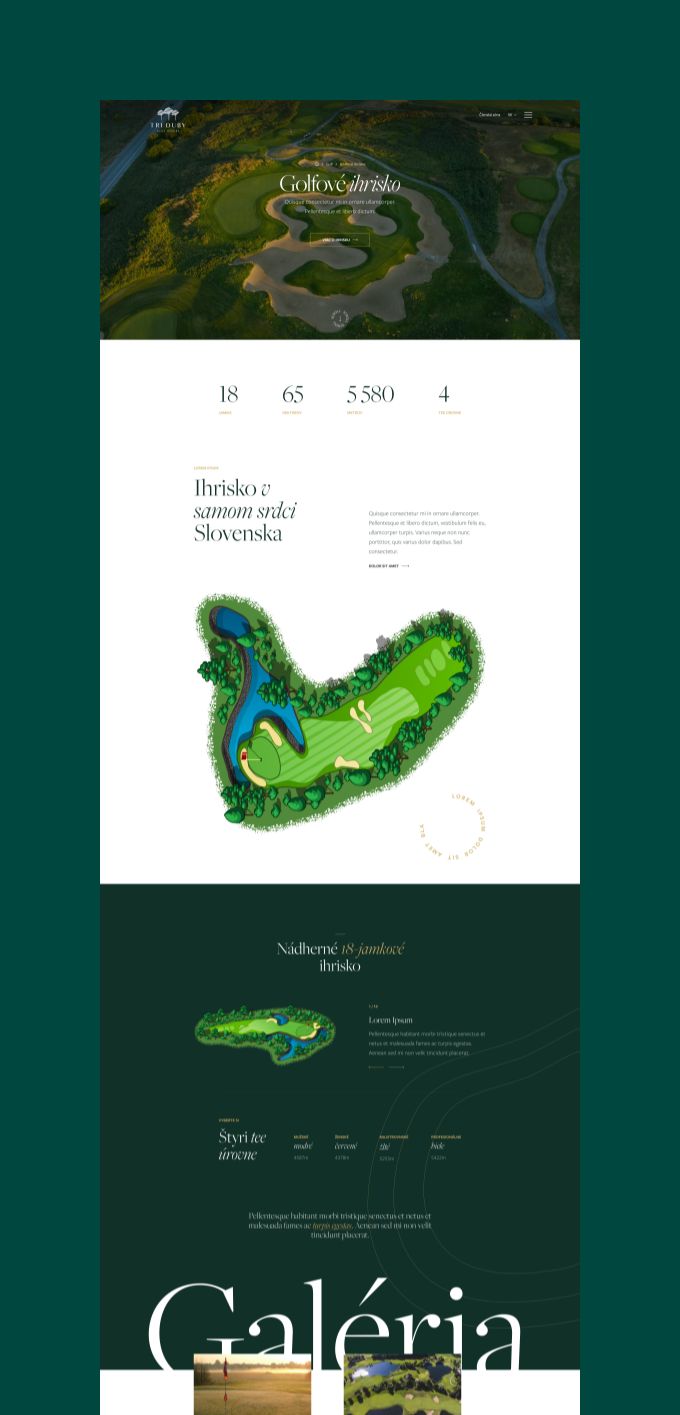
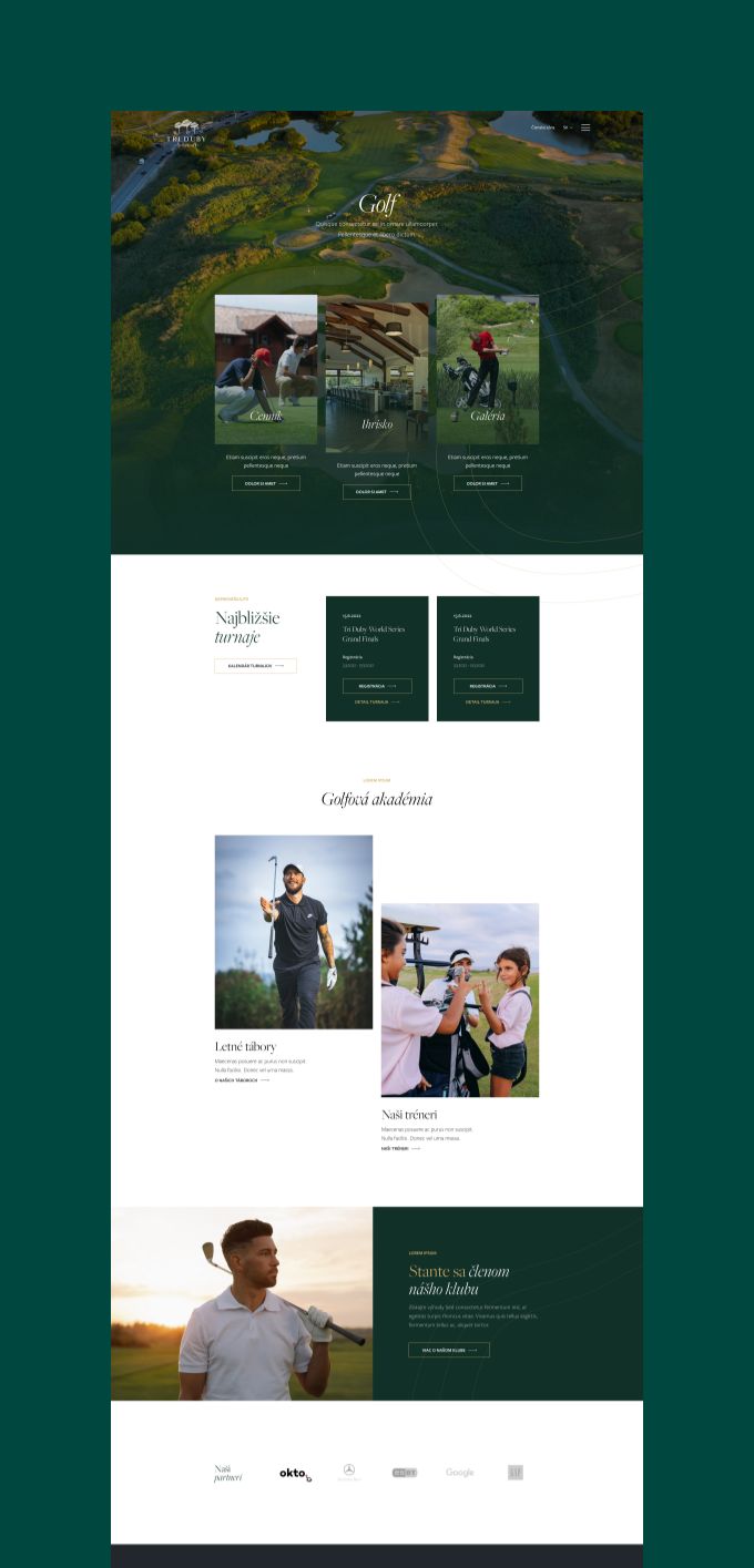
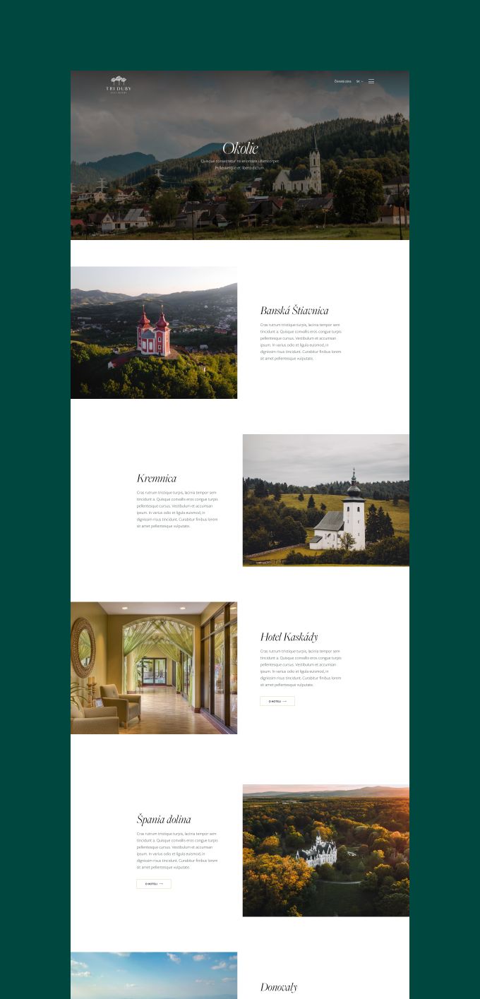
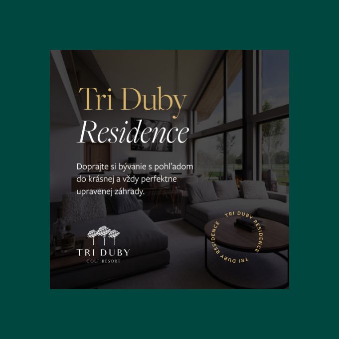
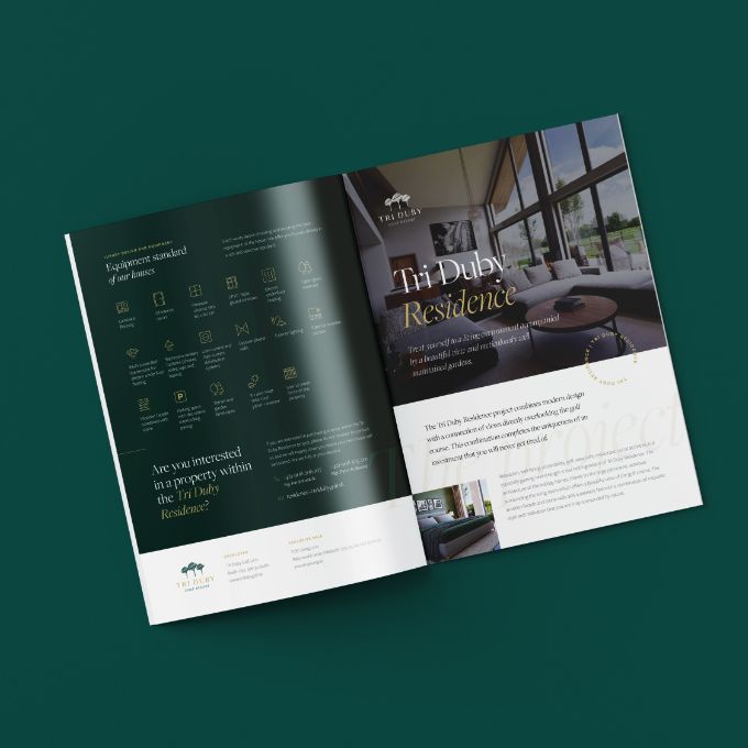
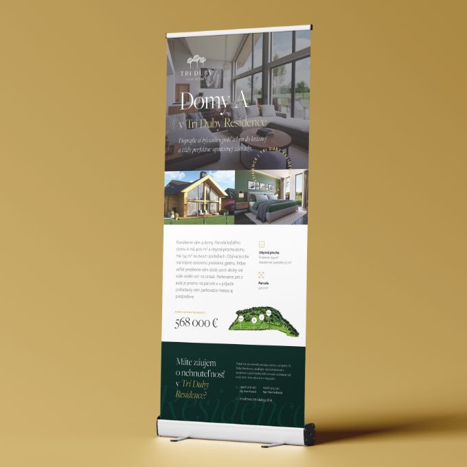
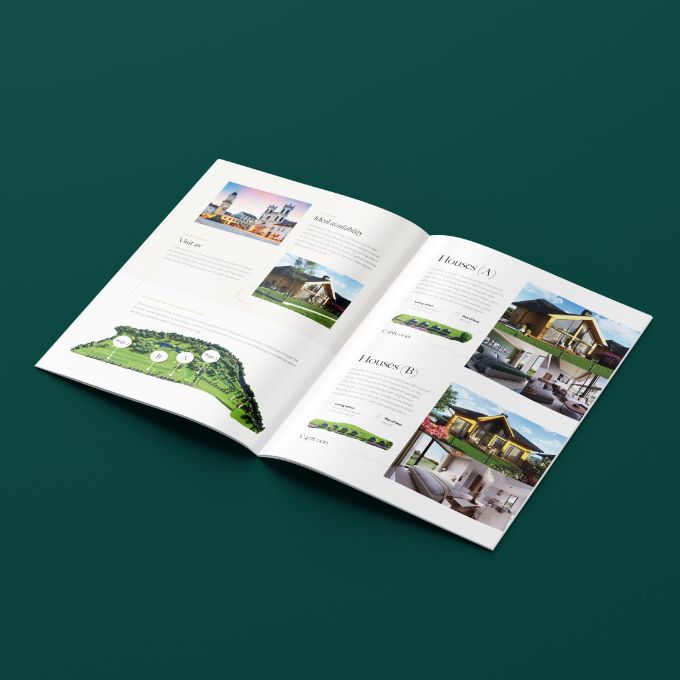
Tri Duby Golf Resort isn’t just a golf course. It’s an 18-hole championship course (Par 70, 5,422 metres) at the foot of the Kremnicke Mountains in central Slovakia, between Banska Bystrica and Zvolen. It’s also a restaurant ranked number one in its area on TripAdvisor. A six-room hotel with golf course views. An event venue hosting weddings and corporate gatherings. A golf academy running summer camps and coaching programmes. And, most recently, a residential property developer building luxury homes alongside the fairways.

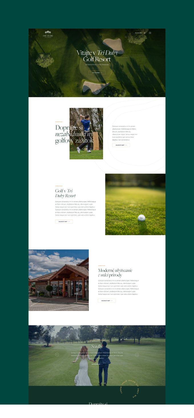
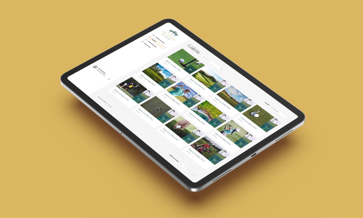
That’s at least six different businesses operating under one brand. The website had to present all of them without feeling like it’s trying to be six different sites at once.

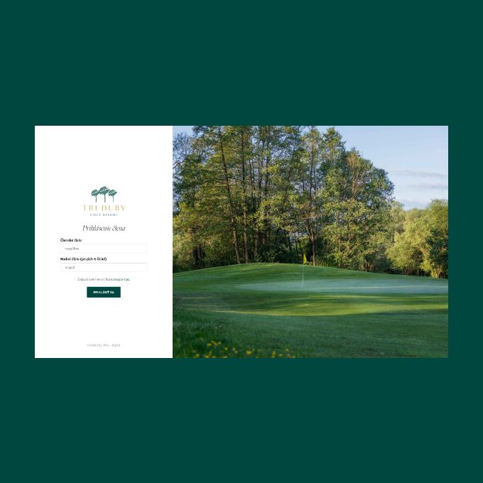
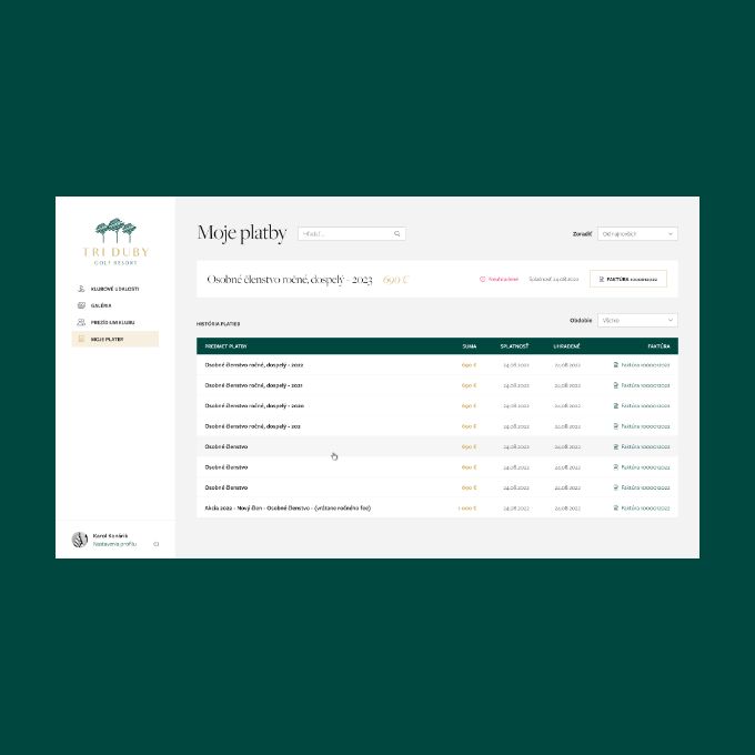
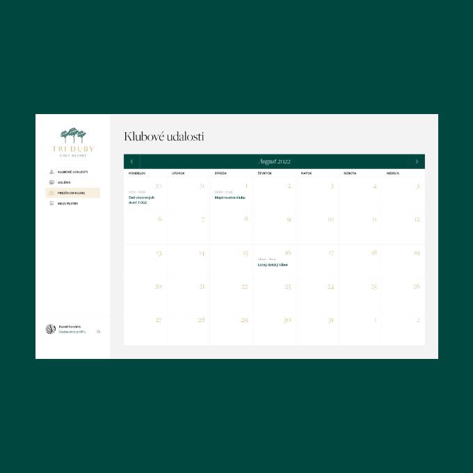
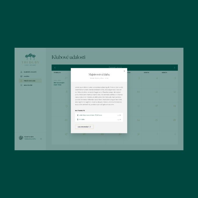
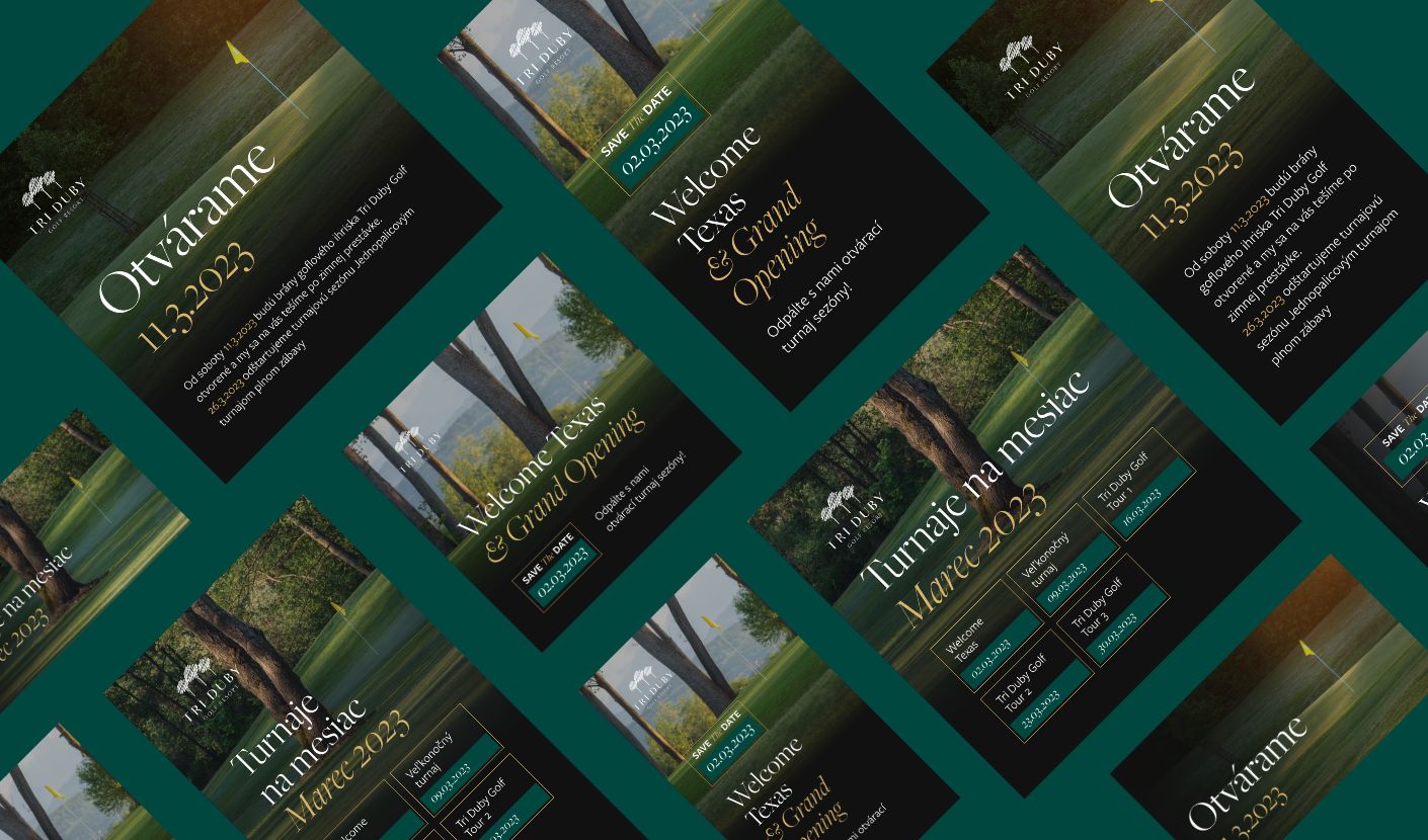
We redesigned the entire website on WordPress with custom programming, built a private member portal with invoicing integration, added a real estate section for their property development, and created the print materials to match. The design language we built — dark green, gold accents, and elegant serif typography — ties everything together so a golfer checking tee times and a property buyer browsing homes at half a million euros feel like they’re in the same place.

Client: Tri Duby Golf Resort
Industry: Hospitality (golf resort, restaurant, accommodation, events)
Year: 2022
What we did: Website redesign, WordPress development, custom programming, member portal, real estate section, print design

cs_triduby_golf_main

What Tri Duby Golf needed

The resort had grown beyond what the existing website could communicate. What started as a golf course had become a full hospitality operation with a restaurant, accommodation, events, an academy, and a members’ club. Each part of the business serves a different visitor. A golfer wants tee times and course information. A couple planning a wedding wants the event spaces and catering. A tourist wants accommodation and the restaurant. A member wants their account, invoices, and upcoming events.

Then came Tri Duby Residence — a development of 10 luxury homes built alongside the golf course, priced between €478,000 and €568,000. The website suddenly needed to sell premium real estate alongside green fees and restaurant menus. That’s a different audience entirely: property buyers evaluating a half-million-euro investment don’t browse the same way someone booking a tee time does.

The resort also needed a private member zone where golf club members could log in, see upcoming events, and pay their annual memberships directly. The old setup couldn’t handle any of this.

Beyond the website, Tri Duby needed print materials — brochures promoting the golf resort, rollup banners for events, and a dedicated booklet for the real estate development — all sharing the same visual identity.

How we approached it

Video that does what photography can’t

Golf courses are hard to capture in still images. The way morning mist lifts off the fairways, the play of light through trees along the Hron River, the scale of the Kremnicke Mountains behind the 18th green — these are experiences that happen in motion. A single photograph flattens all of that.

We built the homepage around a full-width video header that captures the course in motion. It’s the first thing visitors see, and it does something no hero image could: it communicates what it actually feels like to be there. The video runs behind the headline and “Reserve Tee Time” call to action, giving the site an immediate sense of immersion before the visitor scrolls a single pixel.

This wasn’t just an aesthetic decision. For a hospitality business competing with resorts across Europe for visiting golfers, the emotional first impression matters. The video makes Tri Duby feel like a destination, not just a facility.

A colour palette rooted in the landscape

The visual identity centres on dark forest green and warm gold. That’s not arbitrary. Tri Duby Golf Resort sits in a forested valley at the base of the Kremnicke Mountains. The green comes directly from the environment — the fairways, the surrounding forests, the landscape that defines the setting. The gold adds a layer of refinement that positions the resort as premium hospitality rather than just a sports facility.

We paired these colours with Freight Big Pro, an elegant serif typeface used at large scale for headlines, and Freight Sans Pro for body text. The italic serif headlines at light weight give the site a quality that sits between editorial design and luxury branding. It’s sophisticated without being stiff.

The typography and colour palette carry through every element: the full-screen navigation overlay (which splits into an atmospheric course photograph on one side and the menu on the other), the rotating decorative text elements, the CTA buttons rendered as refined outlines rather than solid fills. Every detail reinforces the same positioning: this is a premium experience in a natural setting.

[IMAGE: Design details showing the dark green and gold colour palette, Freight serif typography, and the full-screen navigation overlay with split image/menu layout]

“We cannot imagine better cooperation, and their professional approach to all requirements has convinced us that this company has tremendous growth potential thanks to its leadership and assembled team.”

Karol-K
Karol Konárik — CEO @ EUROCOMPANY ®

Tri Duby Residence

Building a real estate section into a golf website

When Tri Duby launched their residential development — 10 homes in two types, with solar panels, triple glazing, and golf course views — the website needed a section that could sell property at premium prices. This was the trickiest design challenge of the project.

Real estate buyers expect a certain level of presentation. Architectural renders need space to breathe. Floor plans need to be clear. Specifications need to be detailed without being dry. But this section had to live inside an existing golf resort website without making it feel like two sites stitched together.

We designed the Tri Duby Residence section with its own visual rhythm — large-format 3D renders of the homes and interiors, clear specifications for each property type, and dedicated CTAs for enquiries — while keeping it visually consistent with the rest of the site. The same dark green backgrounds, the same gold accents, the same Freight typography. A visitor browsing the residence section never feels like they’ve left Tri Duby’s world.

The architectural renders carry the visual weight here. When the houses don’t physically exist yet (a challenge we know well from our work on the Galandov Majer development), the quality of the renders determines whether a buyer takes the project seriously. We gave them the space and presentation they needed.

A member zone that actually works

Golf club memberships involve real money — annual fees at Tri Duby range from €100 for children to €890 for adults. Members expect a proper system for managing their accounts, not a login page bolted onto a WordPress site.

We built a custom member portal on its own subdomain (member.tridubygolf.sk), separate from the main website but accessible from the header on every page. Inside, members can check upcoming events and meetings, view their account status, and pay their annual memberships directly. We integrated the portal with the resort’s invoicing software so payments flow through without manual processing.

This is the part of the project that’s invisible to most visitors but essential to the business. A golf club lives on its membership base. Making the admin experience smooth for both members and the Tri Duby team isn’t a feature — it’s infrastructure.

Social networks

To promote the new website and activities of The Golf Club, we designed a set of posts and images for social networks that align with the club’s brand identity and complement the new website. Our team worked diligently to ensure that the messaging and visuals accurately reflected the club’s values, vision, and mission.

Our aim was to create a cohesive and consistent visual narrative that effectively conveyed the club’s unique selling points and enticed visitors to engage with the website and its offerings.

A golf resort’s marketing doesn’t live entirely online. Tournament announcements, event promotions, and especially real estate sales all benefit from physical materials that visitors can pick up, take home, and share.

We designed brochures promoting the golf resort, rollup banners for events and the clubhouse, and a dedicated booklet for the Tri Duby Residence development. All of it uses the same dark green and gold palette, the same Freight typography, and the same visual approach as the website.

We also created a set of social media templates and posts aligned with the brand identity, giving the resort a consistent visual presence across every touchpoint — from Instagram posts promoting upcoming tournaments to the physical brochure a property buyer picks up at the clubhouse.